OutSight Team builds dedicated editorial desks for media agencies, not a shared pool, a team that works exclusively for one client.
They came with a Canva deck and no brand identity. They left with a full system, approved on first presentation.
Client: OutSight Team
Industry: Editorial/Media
Year: 2026
OutSight Team builds dedicated editorial desks for media agencies. Their model: instead of pulling whoever's available from a shared pool, they build a team that works exclusively for one client. Same people, same standards, same workflow, every day.
The client agency still sets priorities. OutSight runs the desk.
OutSight Team, dedicated editorial desks for media agencies
They came with a Canva pitch deck they'd built themselves and no brand identity. What they wanted: premium, modern, nothing that reads like generic outsourcing. They knew who they didn't want to look like. They just hadn't figured out who they did.
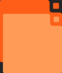
Two things they hadn't sorted out: they weren't sure they needed a logo at all (the name felt like enough), and they had real anxiety around color. A previous project had left them associating orange with something unrelated, so committing to any single color felt risky.
A client who wanted to look like a category leader but wasn't sure they needed a logo or a color. That's where we started.
The argument for "the name is enough" makes sense until you actually need to put the brand somewhere besides a Word document. Favicon. Email signature. Slide deck cover. Materials for a conference. A wordmark alone works when people already know who you are. OutSight was starting from zero.
A brandmark can carry meaning. A wordmark carries letters.
OutSight Team - primary logo lockup
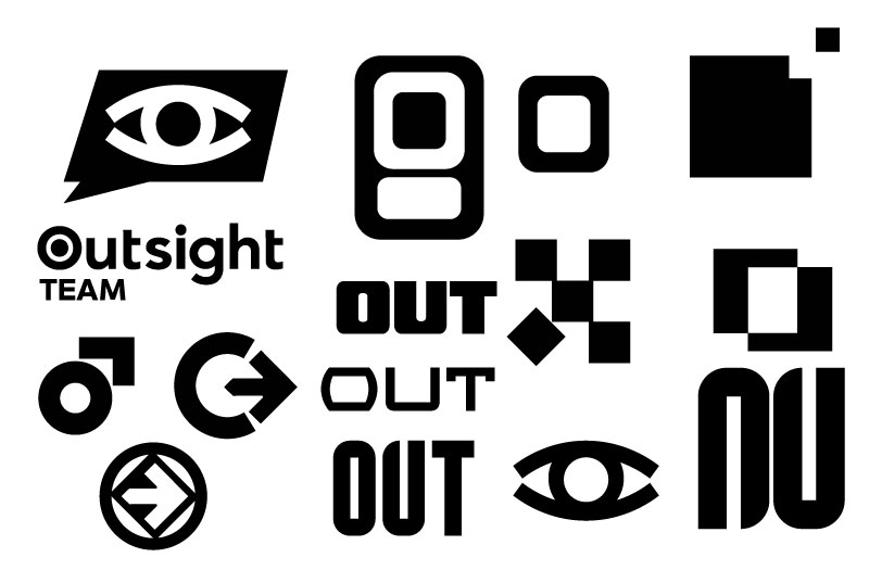
The concept I landed on was a deconstructed box in perspective. Each segment separated, but still readable as a box. The whole brand idea is about thinking outside the box (it's literally in the name) but I didn't want to illustrate it the obvious way. I wanted to take the box apart.The mark ended up holding both sides of what the brand does: structure and perspective, at the same time.
Their first reaction was that it felt retro-modern, not professional-modern. Different things. I refined until it worked.
Their instinct was to pick one color and commit. The anxiety was that they'd pick wrong, or that the color would carry the wrong associations. A previous project had left them associating orange with something unrelated, so committing to any single color felt risky.
So instead of making them pick a color, I built them a full paired palette.
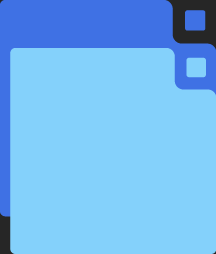
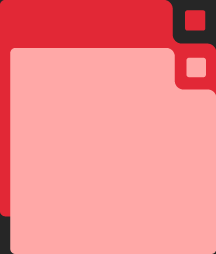
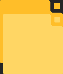
Six primary colors, each with a lighter secondary version: Midnight Violet, Royal Blue, Emerald Green, Signal Red, Vibrant Orange, Golden Yellow. The dark violet (#150f2b) becomes the base for everything, text and dark backgrounds.
Black is what you use when you haven't thought about it.
Dark violet is a decision.
The palette is flexible without being random. Eventually, they could use different color families for different client contexts. Their own designers will implement that when they're ready. For now, the system gives them somewhere to stand without locking them in.
When they asked about narrowing to one hero color eventually, I brought up Coca-Cola. Everyone knows that red. OutSight could build that kind of recognition. It just takes time.
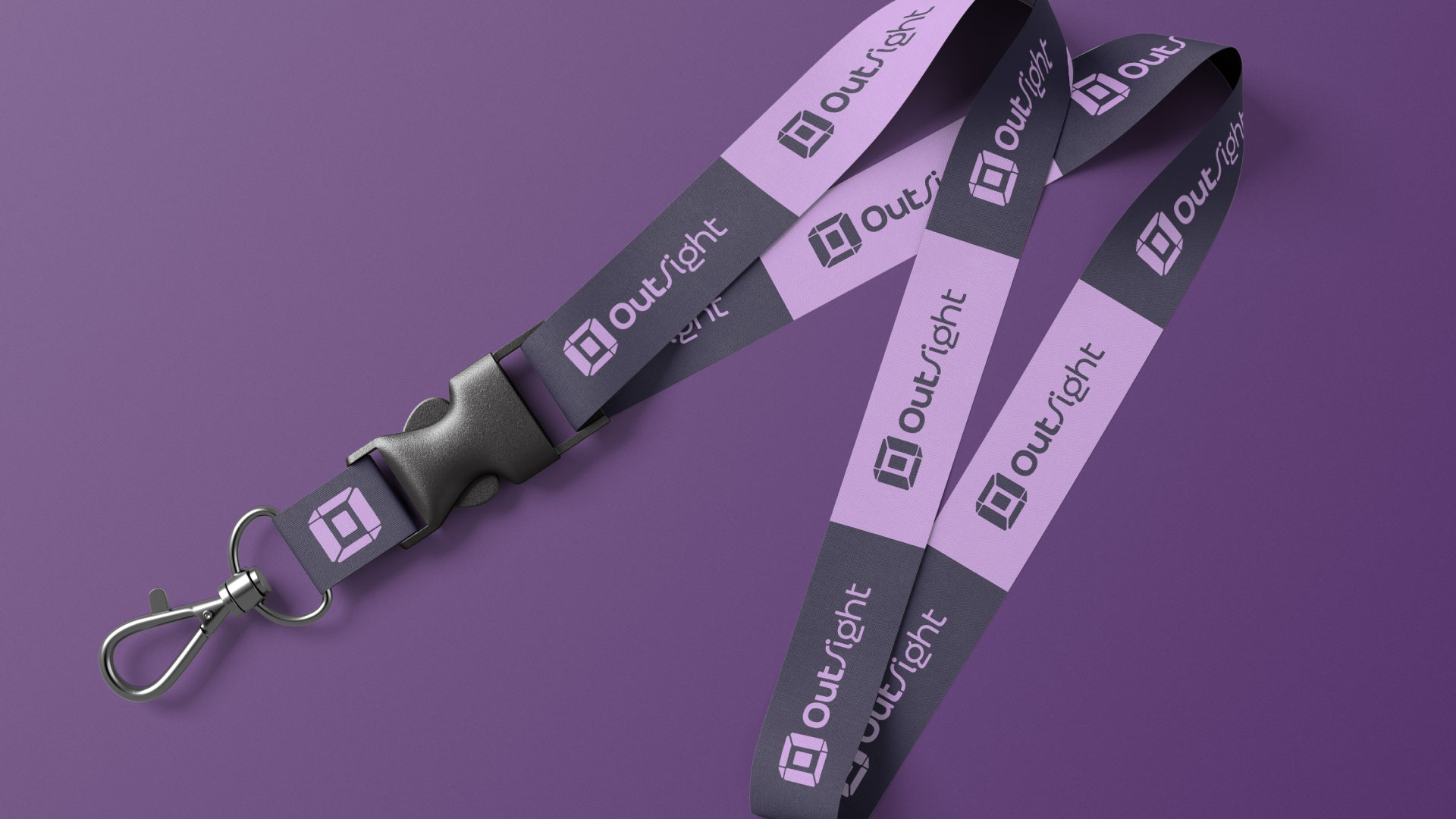
Color palette across brand applications
OutSight Color System - six paired primaries

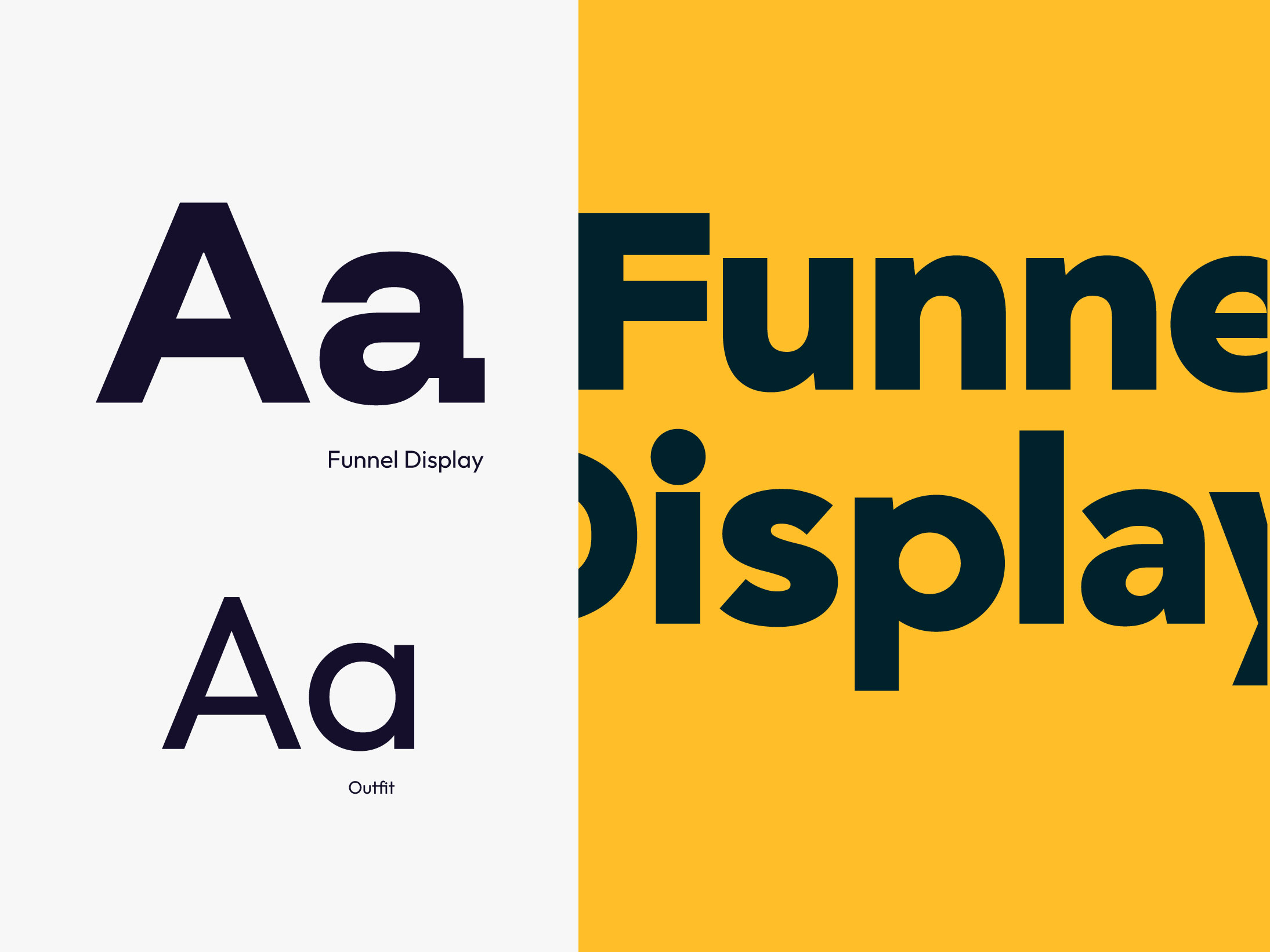
Typography: Funnel Display for headlines, bold, not aggressive. Outfit for body copy, readable, structured. The pairing holds authority without being heavy.
Brand personality: I developed a dual archetype framework because the brand genuinely operates in two modes. The editorial, standards-first side - The Sage. The systems-builder, execution side - The Creator.
The tone of voice comes from that: direct, specific, no buzzwords. Which is also how they actually talk.
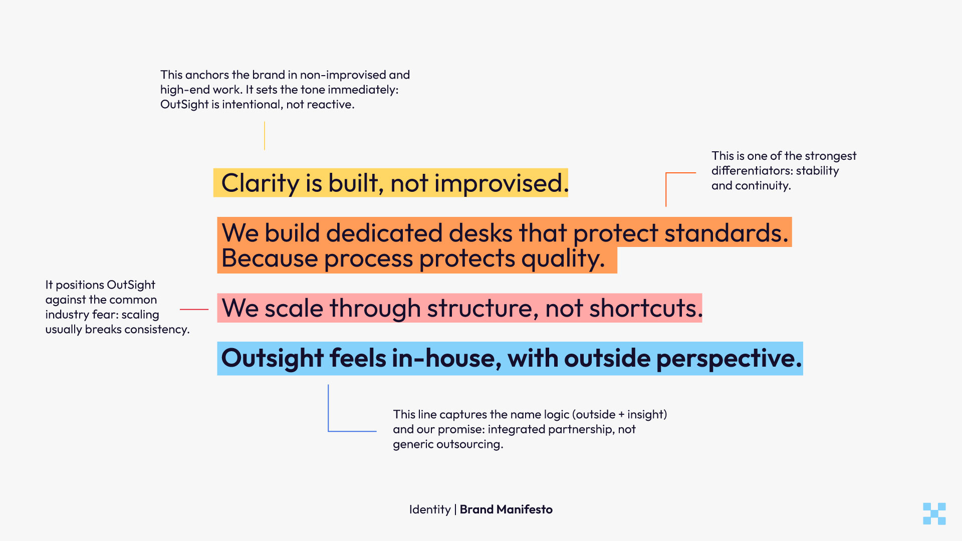
Brand manifesto - voice, character, reason for existing