EcoDeliver built Astracy, a tech-forward PUDO brand that worked beautifully on paper. Then the market talked back. The corner store owners, the neighborhood entrepreneurs, the people running the actual points didn't see themselves in it.
Dropick is the answer: the same logistics infrastructure, built this time for the people who power it.
Astracy landed well, internally. The brand was sharp, the visual system was tight, and EcoDeliver loved it. But when they put it in front of the people who'd actually operate Dropick points (local business owners, corner stores, pharmacies, small-format retailers across Spanish-speaking cities) the response was honest: it doesn't feel like us.This wasn't a failure. It was intelligence. Astracy was designed for what the founders believed about their brand. Dropick had to be designed for what the market needed from it.
The strategic pivot, from tech-forward to human-first
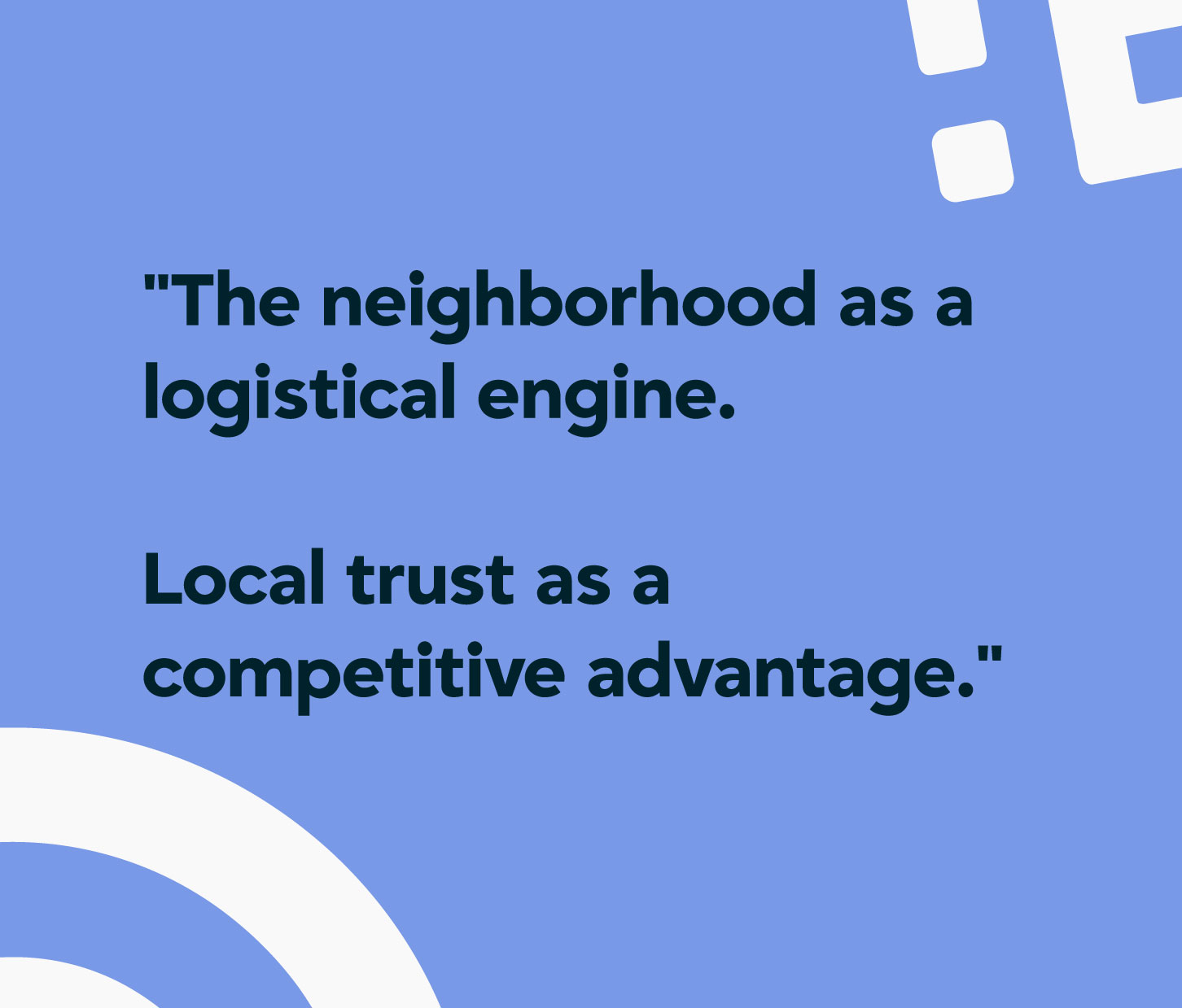
The core insight was simple but demanded everything change: PUDO points aren't technology. They're people. Don Carlitos' hardware store. María's stationery shop. The pharmacy that everyone in the neighborhood trusts. These aren't logistics nodes — they're the social fabric of cities. The brand had to sound like it understood that.
The brief wasn't "make it friendlier." It was: design something that a corner store owner would put on their window and feel proud of. That's a completely different design problem.
New name. New strategy. New visual language. Same logistics engine. That was the scope.
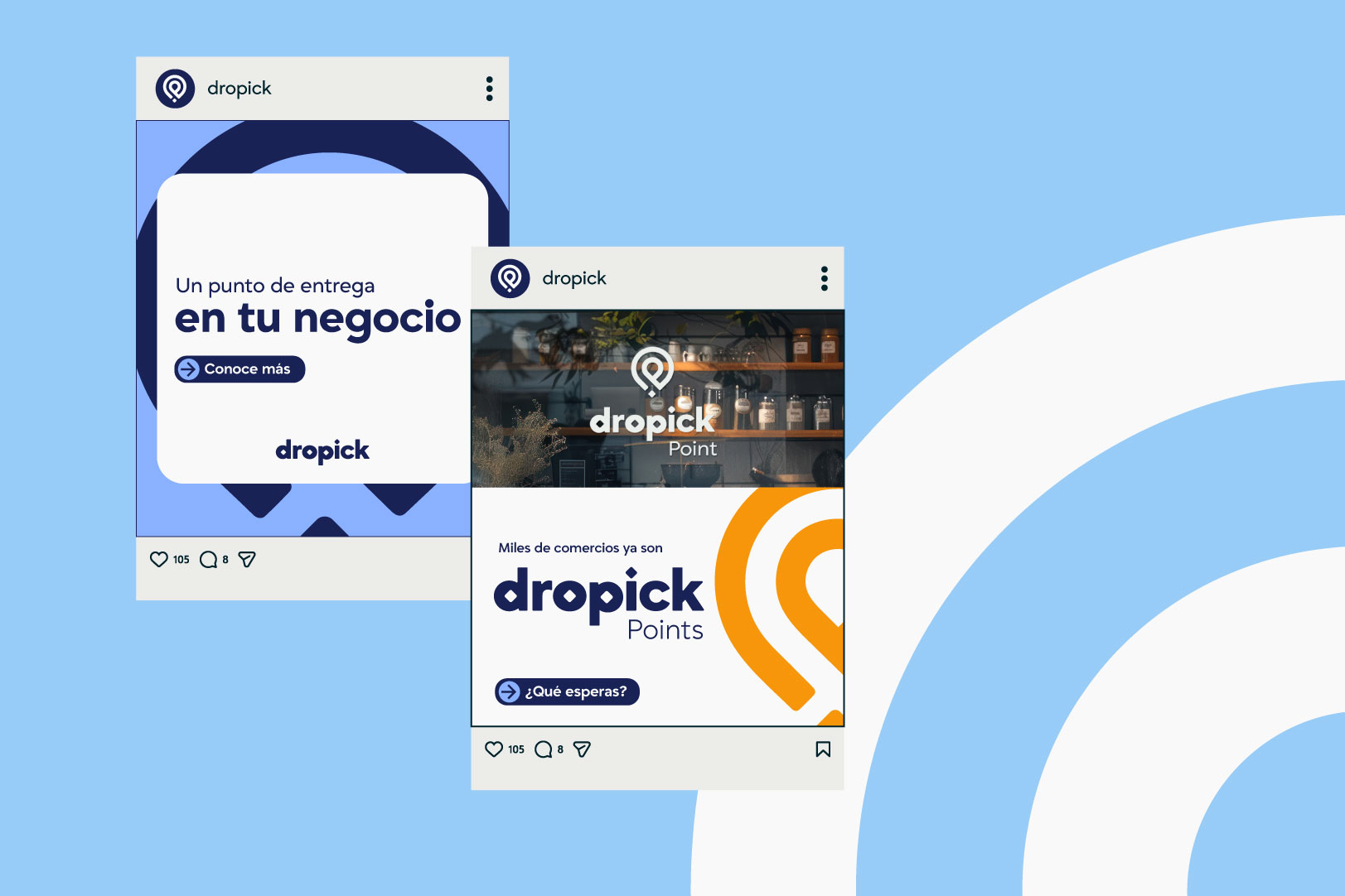
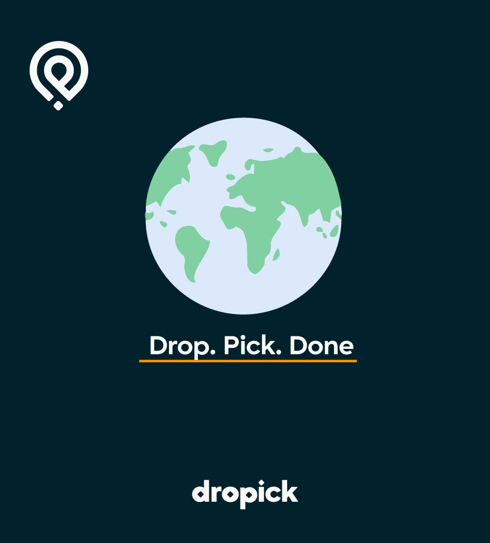
The name Dropick came from the core operation: you drop a package, someone picks it up. Direct, action-based, impossible to misread. Where Astracy was abstract and aspirational, Dropick is concrete and immediate. The tagline that fell out of it almost wrote itself: Drop. Pick. Done.
Three words. Three actions. Everything that needs to be said, said.
The tone shift was total. Where Astracy spoke in the language of tech (precise, ambitious, forward-looking) Dropick speaks in the language of the commercial. Direct. Warm but not soft. Practical but never boring. The do's and don'ts in the brand manual swap "optimiza tu operación logística" for "gana más con el espacio que ya tienes." Same idea, completely different relationship with the reader.
Dropick doesn't use technology to impress. It uses it to solve. Less failed delivery attempts, more income for the merchant, more convenience for the consumer.

The first logo approach was honest about the brief. It started from the name's core actions — a D, a directional arrow, a location pin. Drop. Pick. Done, but drawn. It was altamente visual, descriptivo, llega y sale. Everything the brand was trying to say in three graphic symbols connected together.
EcoDeliver liked the direction immediately. The logic was clear. But the execution still felt like an exploration — a starting point, not a destination. And there was something that nagged: the generic location pin.
The client didn't care if the icon looked like something that already existed. They understood it was a common symbol — people recognize location pins, and that recognition had value. I wasn't willing to accept that.
This became the defining tension of the whole logo process. Recognition vs. distinctiveness. The location pin is universal — everyone understands it instantly, which is exactly what Dropick needed. But if you use a generic pin, you're not building a brand. You're putting your name next to an icon that belongs to no one.
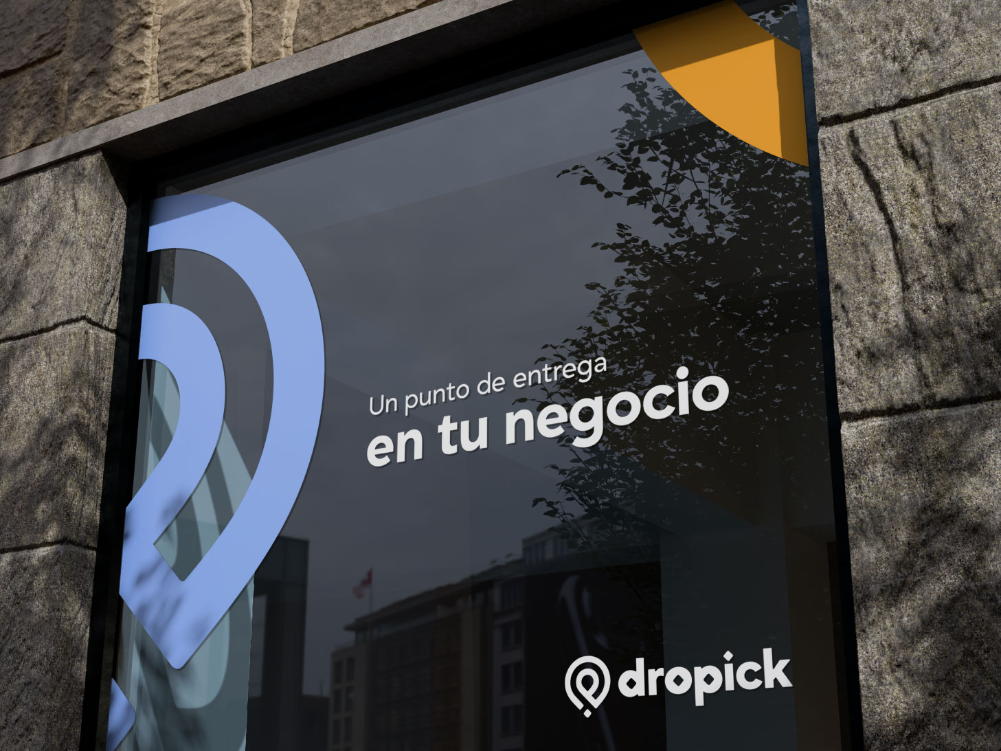
The challenge: make the location pin unmistakably Dropick.

Logo explorations — every direction was explored before the final decision
Twenty-four different directions were developed and rejected. Some took the D-lettermark deep into abstraction — double arrows, mirrored shapes, chevron systems. Some tried to turn the "dp" initials into icons directly. Some wrapped the pin inside the D. Some merged the arrow and the pin. Some leaned into geometric construction. Some leaned into warmth.
None of them held together the way the brief demanded. Each version solved part of the problem and created another one.
The breakthrough came from accepting the premise without accepting the limitation. Yes — it had to be a location pin. The market was right about that. People recognize pins. They trust them. Trying to fight that recognition was a designer's ego problem, not a client's problem.
But a generic pin is a clip art. The question changed: what do you add to a location pin to make it unmistakably Dropick?
Two things. First: the outer ring of the pin was opened — the classic solid circle becomes a pin with a loop, a pin that breathes, a pin that moves. Second: the detail inside isn't a dot. It's a diamond. And that diamond is a deliberate Easter egg.
Depending on how you look at the isotype, the shape suggests the letters "d" and "p" — the initials. It's never stated, never announced. It lives in the logo quietly, as something you discover rather than something you're told. That's the difference between a generic icon and a brand.
The wordmark completes it. Grift — the single typeface that runs the entire brand — is set in semi bold, lowercase. The "o" and "p" inside "dropick" carry small diamond cutouts that mirror the isotipo. Every piece of the logo connects to every other piece. That coherence is what makes it read as a system, not just a name with an icon next to it.
The goal was never to invent a new kind of pin. It was to make a pin that, once you see it on a wall, you know it could only be Dropick.
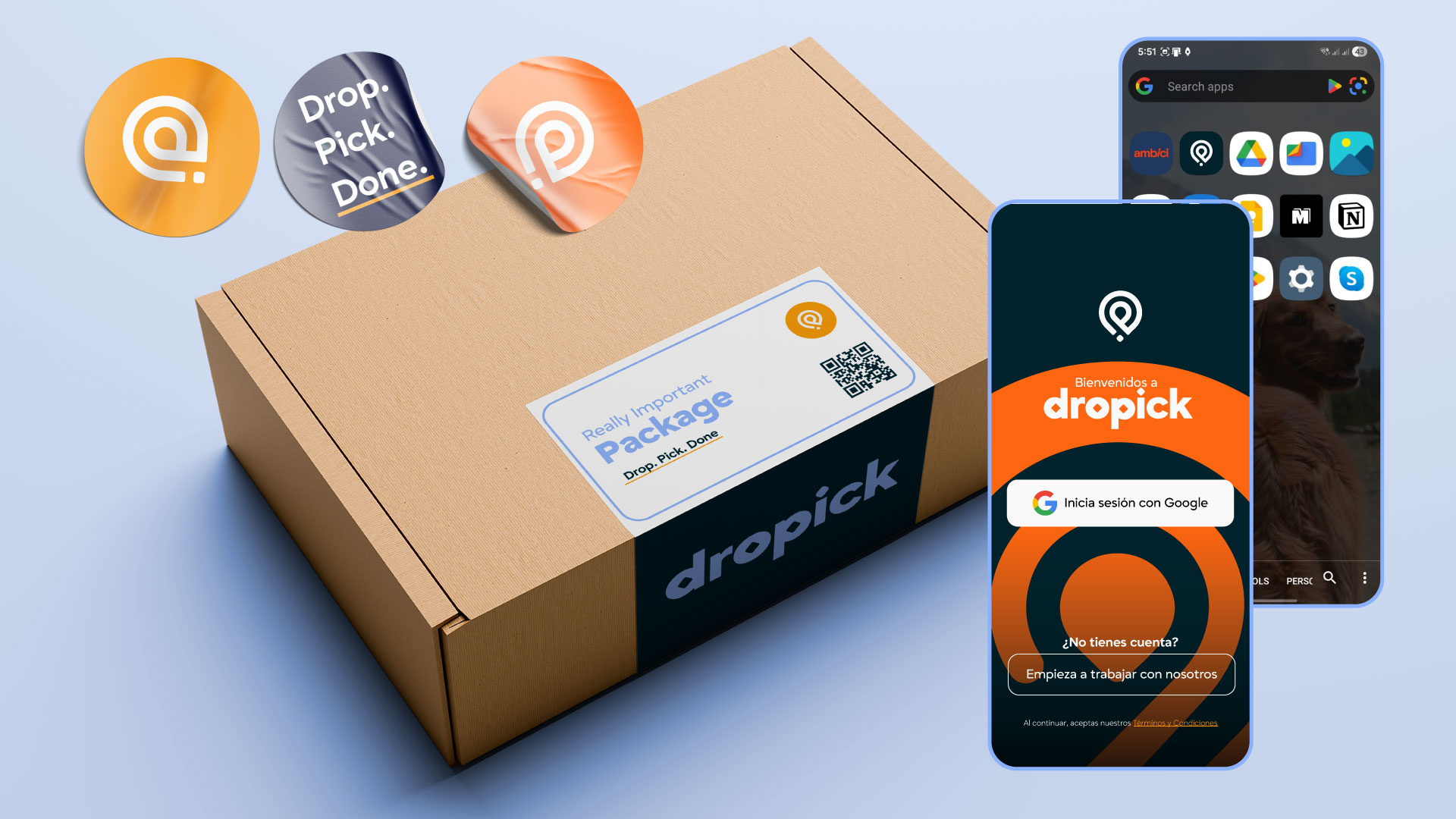
Astracy's palette was built as a journey through space — cold, precise, expanding toward warmth only at the far end. Dropick inverts the emotional logic. The warmth is upfront. The darkness is the anchor, not the destination.
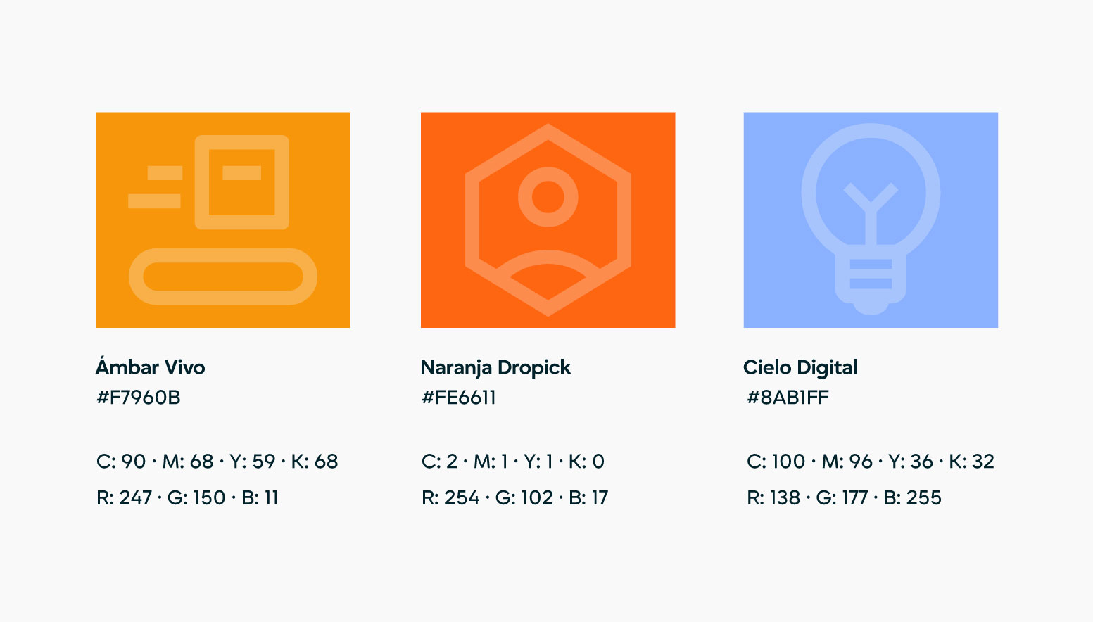
Noche Urbana (#00222B) is the darkest — a deep, slightly warm teal that reads like the city at night. Not cold corporate black. Not techno. A specific kind of dark that feels like something real happened here.
Naranja Dropick (#FE6611) is the primary action color. It hits. Buttons, CTAs, highlights — everything that says "move." Its sibling, Ámbar Vivo (#F7960B), carries the warmth at a lower energy level: badges, secondary emphasis, the kind of orange that belongs on the package label stuck to a cardboard box heading to someone's neighborhood.
Cielo Digital (#8AB1FF) carries the technology credibility the product still needs. It's the sky above the barrio — accessible, not cold. It shows up in informational states, supporting UI elements, and anything that needs to say "this is a system" without losing the human tone.
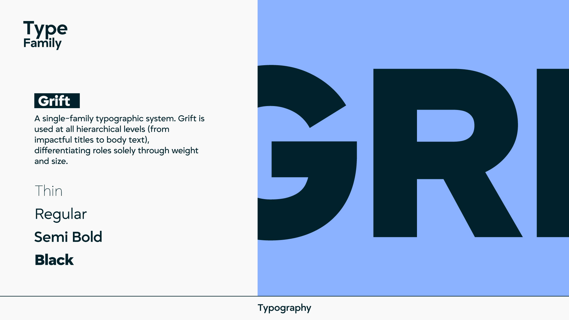
Typography was simplified from Astracy's two-typeface system into a single family: Grift. A sans-serif geometric with four weights — Thin, Regular, Semi Bold, Black. One typeface does everything: headlines in Black, section heads in Semi Bold, body in Regular, captions in Thin. The simplicity is the point. Dropick doesn't overcomplicate anything, including its own typography.
Grift isn't a beautiful typeface trying to be noticed. It's a functional one that knows exactly what it's there to do. That's the right personality for this brand.
The hierarchy is defined by weight and size only, not by mixing families. That discipline gives everything Dropick touches an immediately consistent feel — whether it's an app screen, a social post, or the tape on a package box.