Pronto
Faltan 4 conferencias y talleres
Y no vamos a decir cuáles
Todavía no podemos decir cuáles. Toca el botón si no te aguantas.
Event platform · Website · 2026
The website for DIST, the design festival of Universidad del Istmo in Guatemala. I designed it and built it, and it ran the whole festival: schedules, registration, QR tickets, check-in at the door, a faculty vote, two games and fifteen collectible stickers, all custom-coded inside Wix.
Architecture / UX flows / UI design / Front-end / Backend logic / Games / Data tools
DIST · 2026
23 a 25 Sep 2026 • Campus UNIS • Guatemala
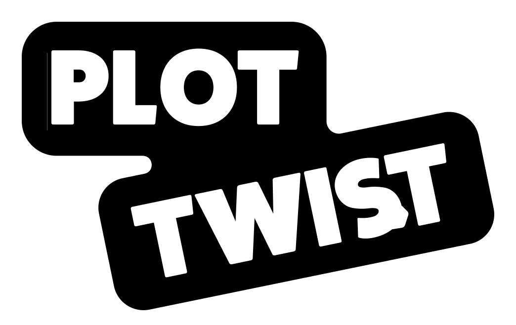
This is the DIST home hero, rebuilt live on this page with the real timing. The words rise at 200, 350 and 500 ms, the sticker drops at 700 ms and wiggles every seven seconds.
Source: the site's own Wix data, pulled October 7, 2026.
DIST has been the design festival of Universidad del Istmo since 2005. Three days of talks, workshops, brand contests, a student market and a closing show, organized every year by the graduating class of Graphic Design. The 2026 theme was Plot Twist.
The 2025 website did one job well: it told you the festival existed. Sign-ups lived in Google Forms, and after the event someone rebuilt attendance by hand from exported spreadsheets. For 2026 I wanted the website to carry the whole loop, from the first click to the QR scan at the door, so nobody had to reconcile anything afterwards.
The university's site runs on Wix Studio, and that wasn't going to change. So every section you see on dist-unis.com is a hand-coded block living in a Wix iframe, talking to a backend I wrote in Velo, Wix's own code layer. Here's what that cost and what I did about each one.
Every big section had to be an iframe.
45 hand-coded blocks, about 48,500 lines, each one talking to the page with postMessage. Eight backend modules handle accounts, sessions, scores, votes and stickers.
Wix Studio ignores heights set by code, and nothing scrolls inside an iframe.
I wrote a headless-browser script that measures every block at four breakpoints, twice: once with Nexa and once with the fallback font, because the fallback sometimes runs taller. The biggest number goes in the editor.
Studio has no real popups.
The mobile menu is two stacked blocks that collapse and expand. Detail sheets open inside their own block, anchored at the height you clicked.
Students open it on their phones, on campus wifi.
Photos go through Wix's image CDN, cropped to the exact size they show at. One 26 MB speaker photo ships at about 39 KB. Small assets are inlined so a block is one request.
Wix APIs accept data and quietly drop it.
The career year vanished from Wix Contacts twice, so it moved into the site's own collections. Every change gets checked on the published site, never on the local file.
On August 7, before building a single page, I cut five from the plan. The line I wrote in the decision log that day: arrive with ten finished pages instead of fifteen half done. Every block also got its file name before it existed, so 45 files never turned into final-v3.
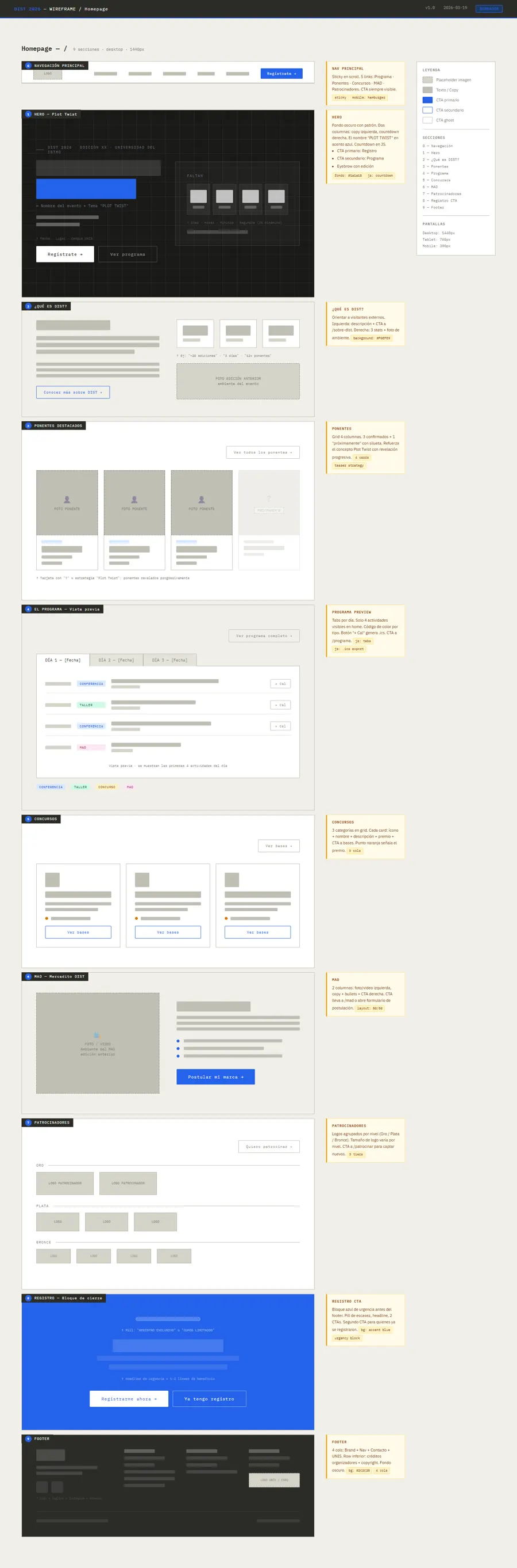
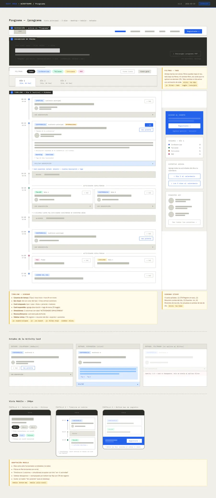
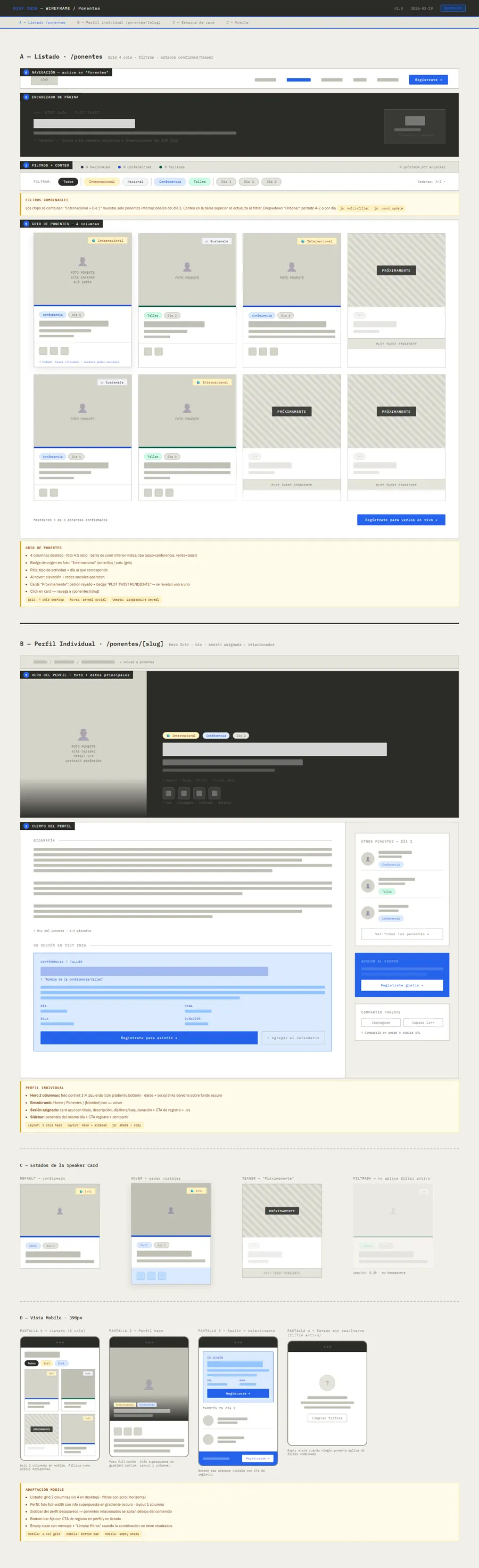
?c=These are the real lo-fi wireframes from March 19, with notes on what each section had to prove. No colors, no stickers, no Nexa. The structure had to hold up before any plot twist went on top. Hover one to scroll it.
Sign up with your @unis.edu.gt address. The server checks the domain, not the browser.
Filter 33 sessions by day, type and area. Time clashes get blocked before checkout.
Wix Events checkout, one free ticket. Three sessions minimum, no cancellations after August 31.
The ticket lands in Mi DIST as a QR pass you can also save as an image.
Staff scan the QR. That scan is the attendance record, nothing to rebuild later.
Showing up unlocks stickers on your Mi DIST board. So does exploring the site.
Of the 119 students in years 1 to 4
Registration opened September 16 at noon. 528 tickets went out that first day, and 25 of the 33 sessions sold out.
The festival identity existed before the site: six colors, a family of shapes and the Plot Twist sticker. My job was turning it into an interface you can read on a phone, outside, at noon. Click a color to copy it.
The rule I measured before designing anything: text goes black on five of the six colors and white only on blue. The small number on each chip is its contrast ratio.
Unpeel the ordinary
Nexa Text · bodyConstruye tu horario, inscríbete y presenta tu QR en la entrada. Brand lines stay in English, information stays in Spanish.
The theme was Plot Twist, so the site kept hiding things. Below are rebuilds of the real pieces, running on the same logic as the live site.
On the real site, finding these unlocked stickers in your Mi DIST. This page has a board too. Play and fill it.
The home page leaves three of the festival's verb stickers on a green wall. Pegar, despegar, sobreponer: stick, peel, overlap. You can grab them and put them anywhere.
How it works Pointer events with pointer capture, so a mouse and a thumb behave the same. A sticker always keeps 30% of itself on the wall, and "Volver al orden" only shows up after your first move.
↓ Despégalos. Muévelos. Pégalos donde quieras.
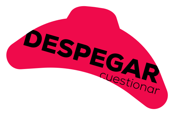
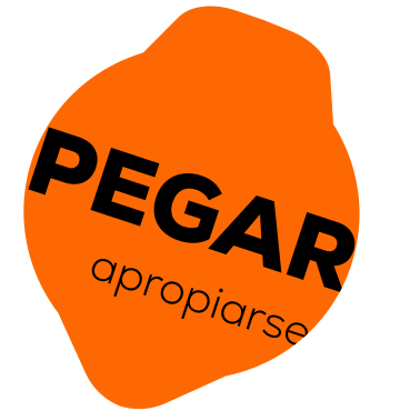
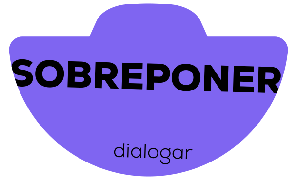
The login page. The shapes run away from your cursor, the email field types fake addresses to itself, and when you finally log in, the site tells you you're not on the list.
How it works Shapes flee inside a 260 px radius with a spring, so they drift back when you leave. The prank has two stages: the denied stamp slams in, and 1.7 seconds later the real welcome replaces it. Type anything here, it's a demo.
No estás
en la lista.
Es broma.
Obvio que estás.
While the agenda was still filling up, the last card in the grid owned it. Its button runs away three times and then lets you click, and every click gives you a new line instead of an answer. When filters left the page half empty, the empty part became a sticker wall.
Faltan 4 conferencias y talleres
Y no vamos a decir cuáles
Todavía no podemos decir cuáles. Toca el botón si no te aguantas.
Click anywhere in here. 0/50
Sigue bajando Pega uno por acá Todavía hay espacio El vacío no se llena solo Casi al finalHow it works The card cycles nine lines, the last one is "Volviste al principio. Igual que las conferencias." On the wall, every click sticks a random brand shape at 40 to 88 px, one of five colors, rotated up to 25°. Every 12th click drops a phrase instead. Something happens at 50.
A game for the contests page, for while people waited on the briefs. One shape is slightly off. It starts with color, then rotation, then size, and from level 7 it picks at random so you can't guess what to look for.
How it works The difference shrinks every level but never goes below 4% color, 5° of rotation or 4% size. Below that it stops testing your eye and starts testing your luck. The board is a fixed square, so going from 4 shapes to 36 never moves the page.
Se acabó
Toca la que está distinta.
MAD is the student market: 42 Guatemalan small brands with tables on campus during the festival. It has its own sub-brand, so its page got its own visual language, receipts. Move your cursor over the logo.

Papelería
Stickers, agendas, notebooks
Lunes a juevesIlustración
Prints, pins, commissions
MartesJoyería
Handmade, one of a kind
MiércolesRopa vintage
Second hand, first pick
LunesCuarzos
Crystals and good intentions
JuevesCases
Phone cases, made here
Lunes a jueves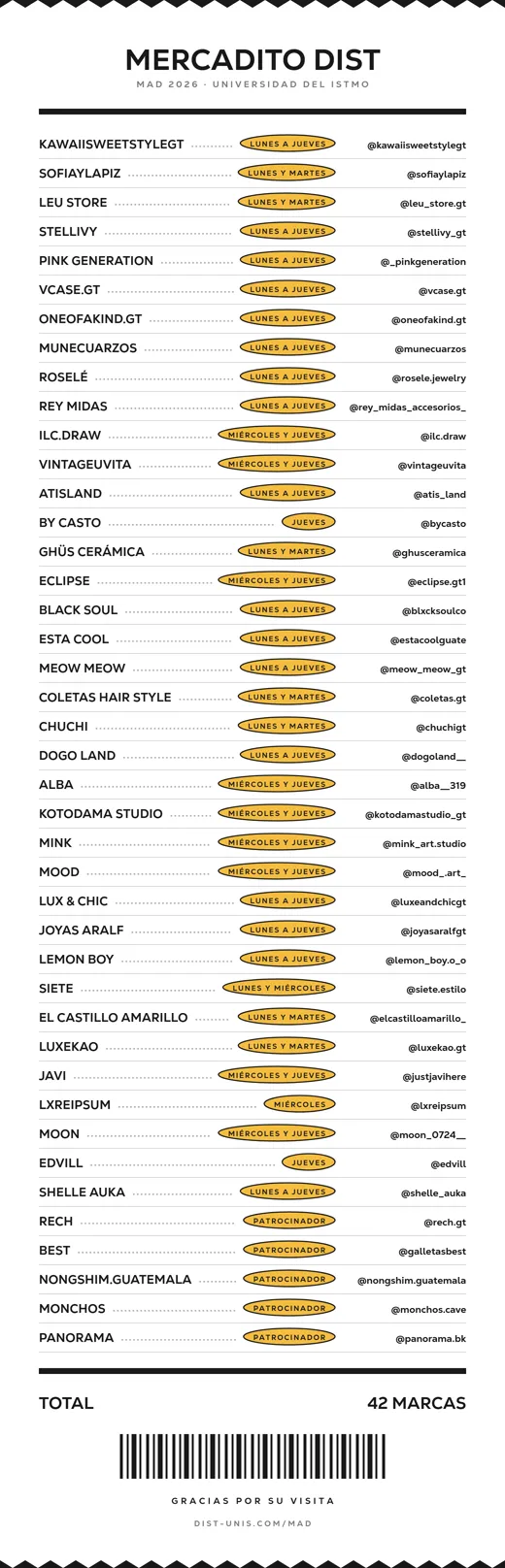
The real roll: all 42 brands as one long receipt. On the site it also downloads as a PDF with every Instagram handle clickable.
How it works A soft 130 px circular mask follows the cursor and reveals a recolored copy of the logo, and the color changes every time you come back in. Each card is a receipt with a 16-tooth jagged edge and a random tilt, and they print in from the top 45 ms apart. The cut line swaps the grid for the full roll and unlocks a sticker.
"Se cayó el inventario del mercadito." The market's stock is falling from the sky. Catch the fruit, dodge the flies. 45 seconds, three bags. On the real one, 97 people saved a score.
How it works Fall speed goes from 150 to 500 px/s on a squared curve, so the last fifteen seconds are a different game. After the first third, fruit drops in pairs on opposite sides and you have to choose. Missing fruit never breaks your streak, only flies do. The last ten seconds are "hora pico" and everything counts double.
¿Listo para las compras?
Mueve la canasta con el mouse, el dedo o las flechas.
The sponsors page is a thank-you wall, and it hides a memory game. On the real site you open it by tapping all four shapes in the hero, and the cards are sponsor logos. Here they're the festival shapes.
How it works Six pairs, shuffled every round. When you finish, it tells you how many tries it took and drops a sticker into your Mi DIST. Sponsor tiers on that page are shown by size only, so no logo ever sits next to the words "small package".
Encuentra los pares.
Speaker cards come in two designs, shuffled every visit: a color block, and a conference badge with a real die-cut lanyard hole made with two CSS masks. Click a card to flip it. These four are the international guests of the closing show.
Students opened the site between classes, on their phones. Every block has its own mobile layout instead of a squeezed desktop one. The agenda turns into a list by day instead of 29 stacked cards, which took that page from about 8,000 px of scrolling down to 5,800.
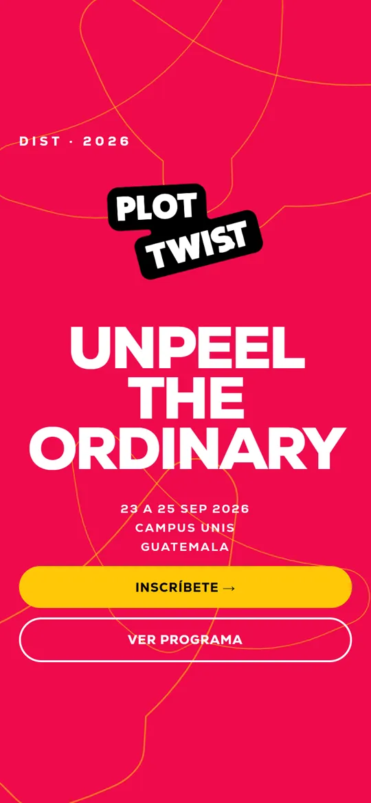
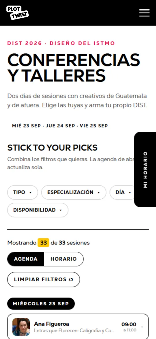
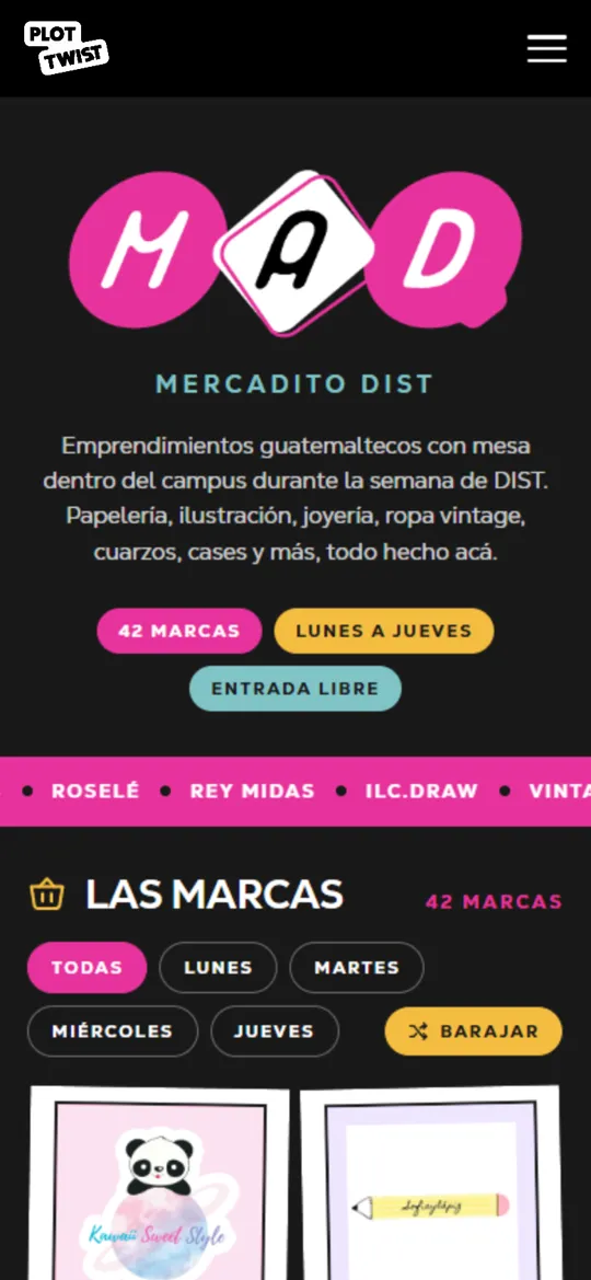
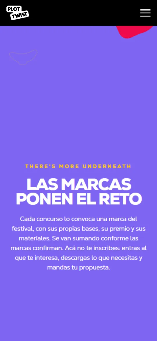
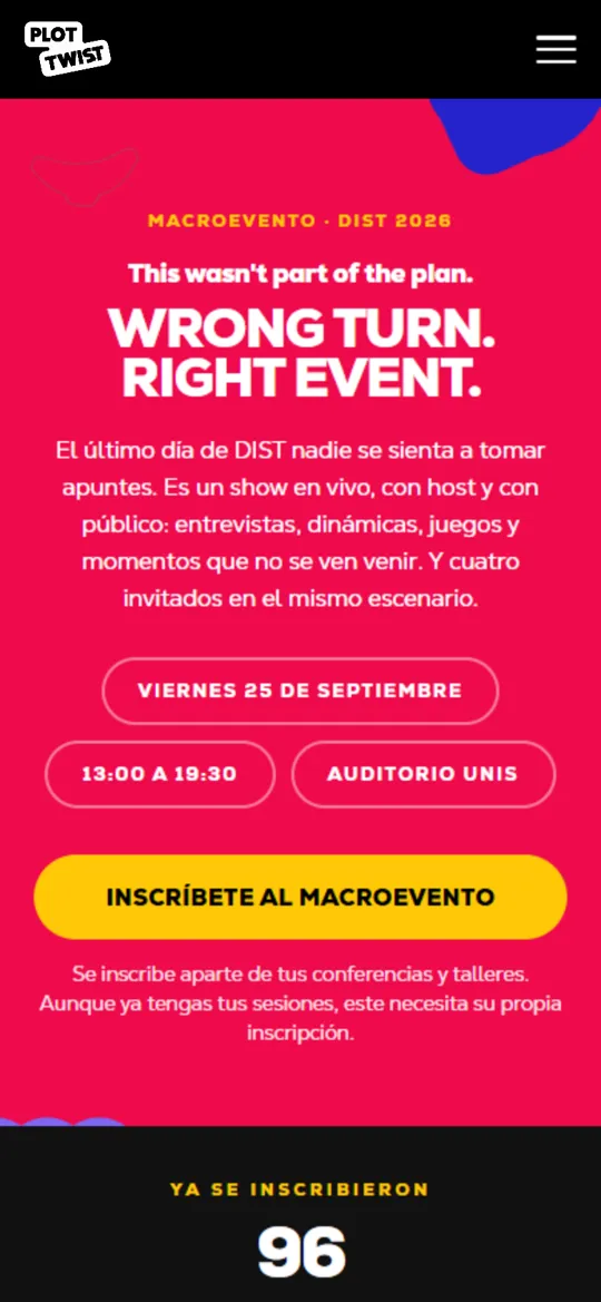
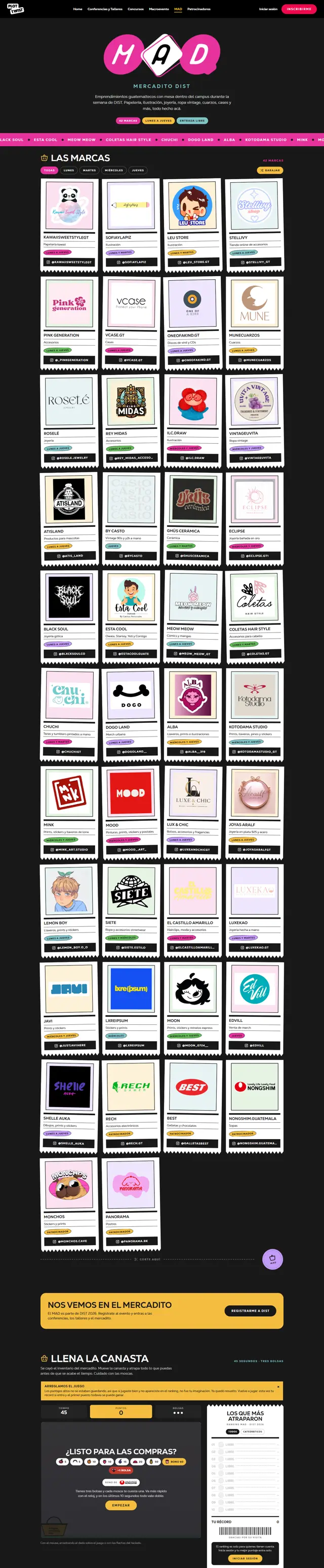
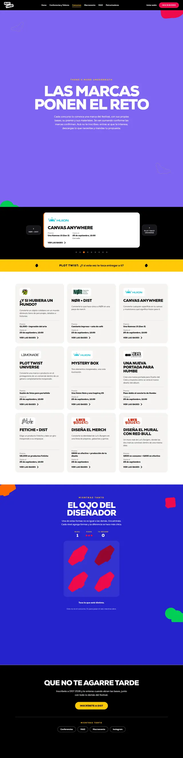
Full captures of the live pages. Hover one and it scrolls itself.

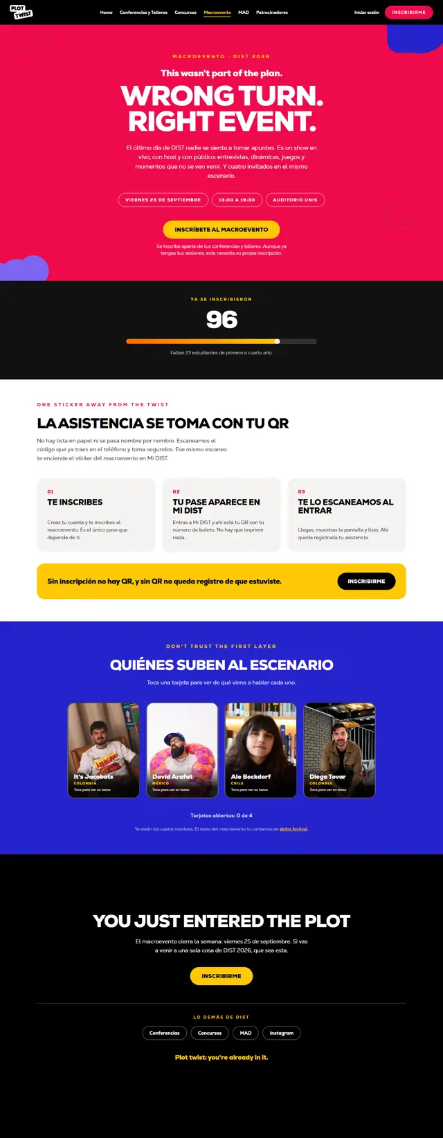
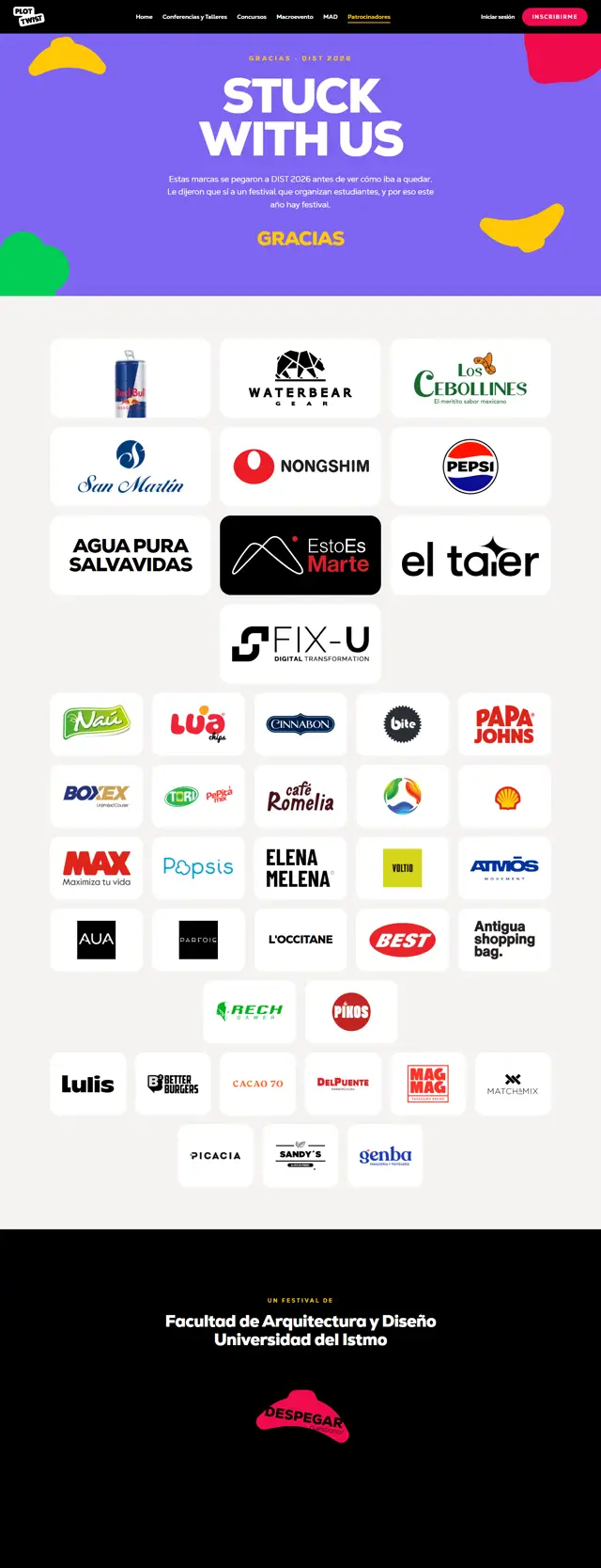
Every call that changed the site got its own file in the project, with the date and the reason. These are the ones that shaped it most.
Cut five pages before building one.
Ten finished pages beat fifteen half done.
Kept Wix's own ticket widget.
Its tickets and QR codes ran check-in at the door, so I wrapped it in custom blocks and CSS instead of rebuilding it.
The speaker is the hero of every card.
There were no room numbers and few talk titles yet, so the data decided the design.
The MAD game uses fruit and points, never quetzales.
With a currency on screen it looked like the game charged money.
Secret sessions hide everything, even their type.
A card's color gave away whether it was a talk or a workshop, so the color went too. You find out after you register.
"Por confirmar" was banned.
It made a well-run festival look disorganized. Missing info got two honest phrases instead.
The sponsor marquee moves at a fixed speed, not a fixed duration.
62 px per second no matter how many logos load, and a new random order every visit so every brand gets seen.
The faculty vote doubled as a data fix.
Voting asked for your career year, which Wix kept losing. 97 votes later, the data was complete.
Contest deadlines became data with a time zone.
The page generator refuses to build if a card's date and its countdown disagree.
I'm a designer, and I built DIST the way a lot of founders build their product now: with Claude writing the code from my direction. I'd describe the block, test it on the published site, and send it back with what was wrong. That's how one person shipped 45 custom blocks, eight backend modules and 22 build tools between August and September.
What the AI couldn't do was decide. It didn't know "por confirmar" would make the festival look messy, or that a currency would make a free game feel paid, or that a button that never lets you click is a joke nobody finishes. Those 21 decision files are the actual work.
562 of 573 seats taken. 519 QR scans at the door. Zero Google Forms.
Sitemap, page inventory and a naming convention for 45 blocks. Two dynamic pages that serve 34 sessions and 9 contests.
Sign-up, schedule building, registration, QR pass, check-in, the faculty vote and the secret Plot Twist sessions.
The festival identity turned into an interface: contrast rules, Nexa type scale, stickers, shapes and a copy system in two languages.
Every section hand-coded as an HTML block inside Wix Studio, with its own mobile layout and measured heights.
Eight Velo modules: accounts and roles, enrolment rules, scores, votes, the sticker sync and who finished the collection first.
Llena la canasta, El ojo del diseñador, the memory game, fifteen stickers, plus the generators and measuring scripts behind it all.
Plot TwistDesign, UX, front-end and build by Dana Michelle. Code written with Claude, every decision mine.
The same peel-off sticker covers the credits on the live sponsors page.
Built your product with AI and now it looks like everyone else's? That's the part I fix.
Want this for your own startup? The Fundable Brand Sprint gets you there in three weeks.
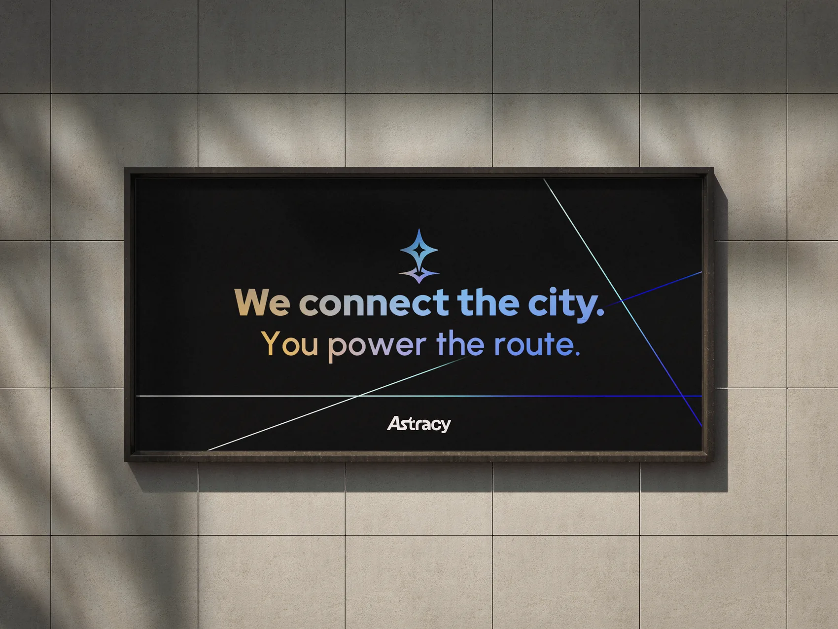
A name, a star-and-pin logo and a color system that moves from technical to human, for an urban logistics platform.
Tus stickers
0/10 unlocked. Tap a locked one to see how to get it.