Naming Strategy
Four fully developed names, each with etymology, tagline, and rationale. Astracy selected, for what the word could carry.
Astracy is the brand I built for an urban logistics platform: a network of pickup and drop-off points run by real people, not machines. I named it, set the strategy, and designed the whole system.
EcoDeliver runs the logistics layer nobody sees: the network of pickup and drop-off points that makes urban delivery actually work. Instead of giant warehouses and last-mile chaos, they place those points inside local businesses, so every neighborhood becomes a node.
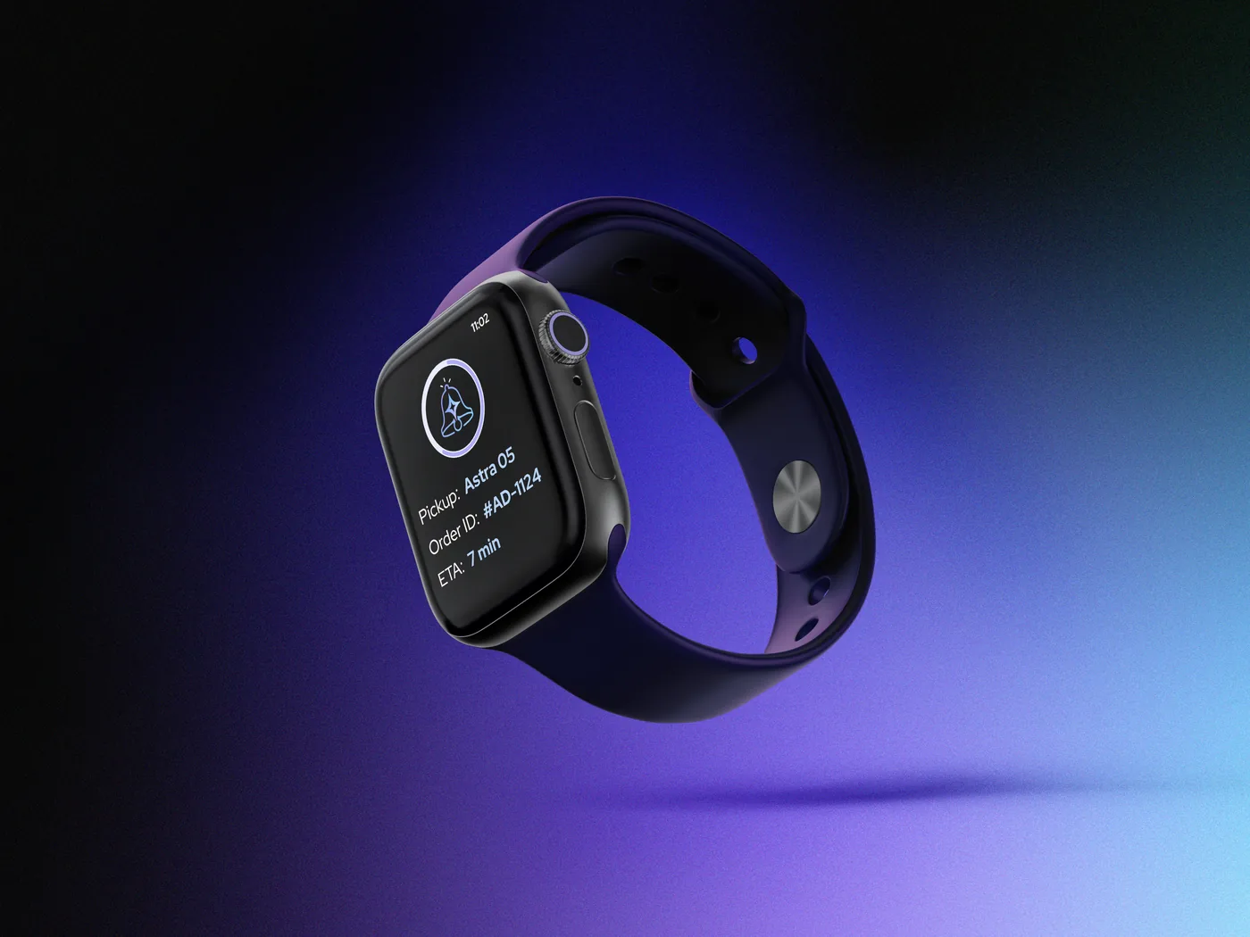
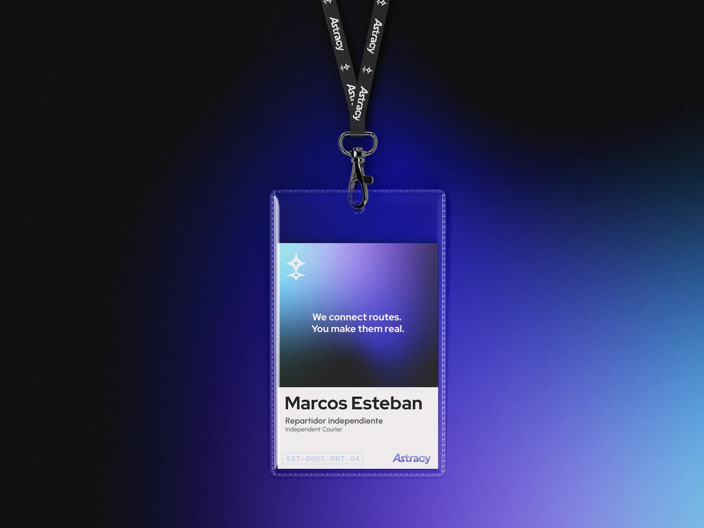
Each point is run by a real person, in a real neighborhood. Not a machine, not a locker. That distinction mattered to them, and it had to live in the brand.
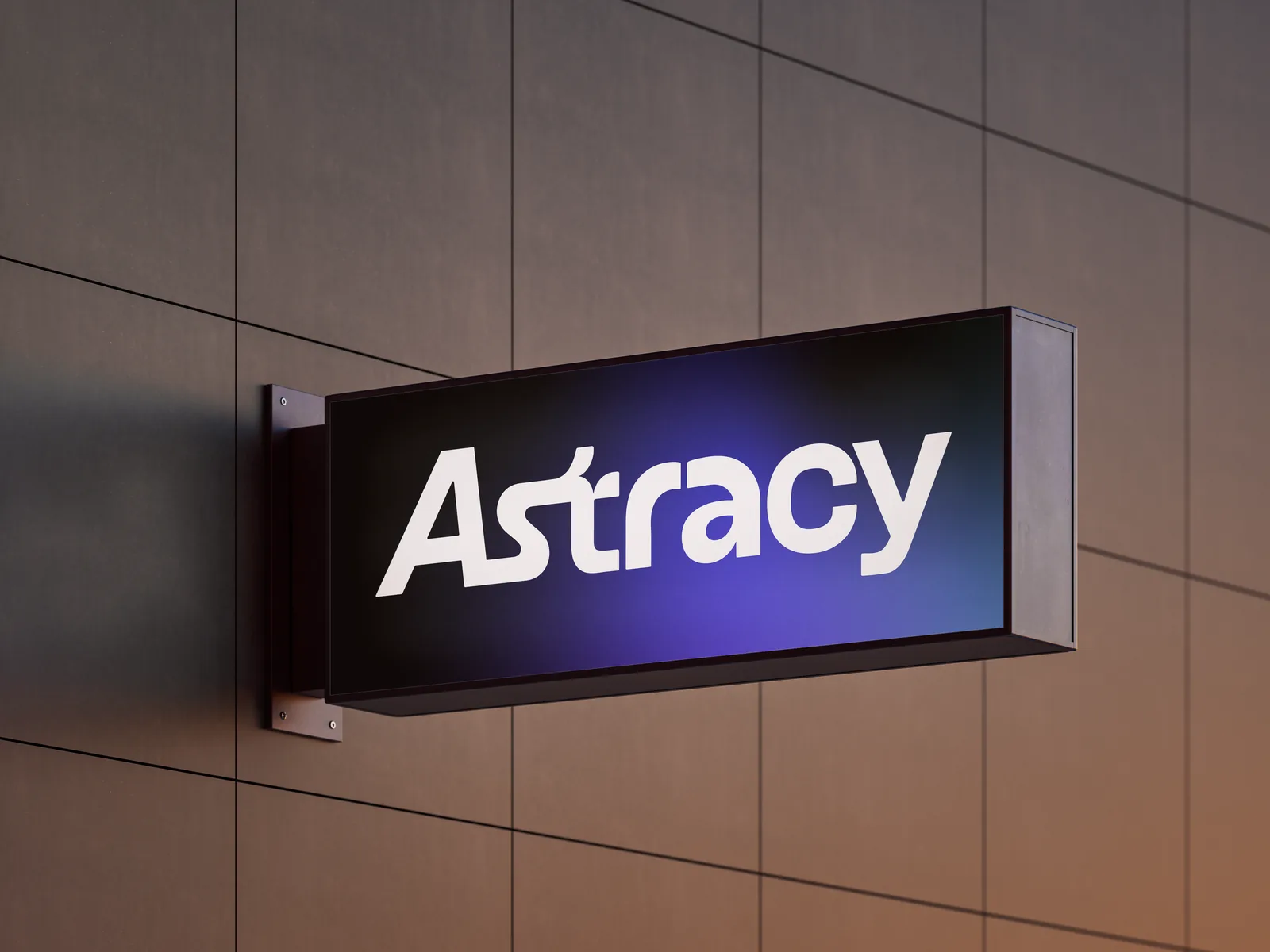
They came with a clear feeling and no name. They wanted it to read techy and futuristic, geometric, dark backgrounds, strong contrast. Not corporate logistics, not another startup cliché. Something that could scale across cities while still feeling built by people who actually know how a city moves.
The brief wasn't "make it look techy." It was: make technology feel human without making it feel soft. That's a tighter needle to thread.
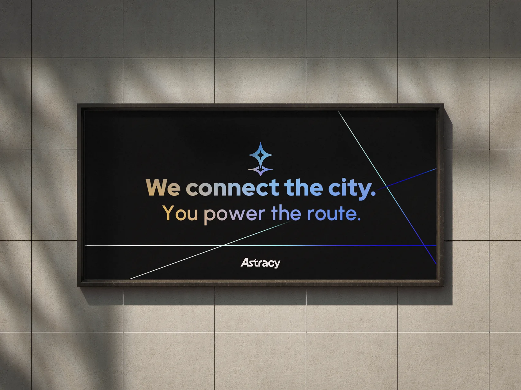
Naming a logistics platform is harder than it sounds. The easy route is functional: RouteX, DeliverNet, PointHub. All forgettable. I wanted a name that could sit in the same room as Stripe or Linear, one that sounds like it belongs in the future.
So I anchored the whole search on a single idea: every pickup point is a star. On its own it's just a location. Connected, they form a constellation, a map that guides how a city moves. That insight is what the name had to carry.
Four names made it to the table, each with its own logic:
Astracy won because it held the most weight. Astros for the stars that guide, since constellations have been navigation tools since the beginning. Legacy for a company built by people who came from the street and actually understand how logistics works. Legacy isn't about being traditional. It's earned weight.
Stars don't just shine. They guide. That was the whole point.
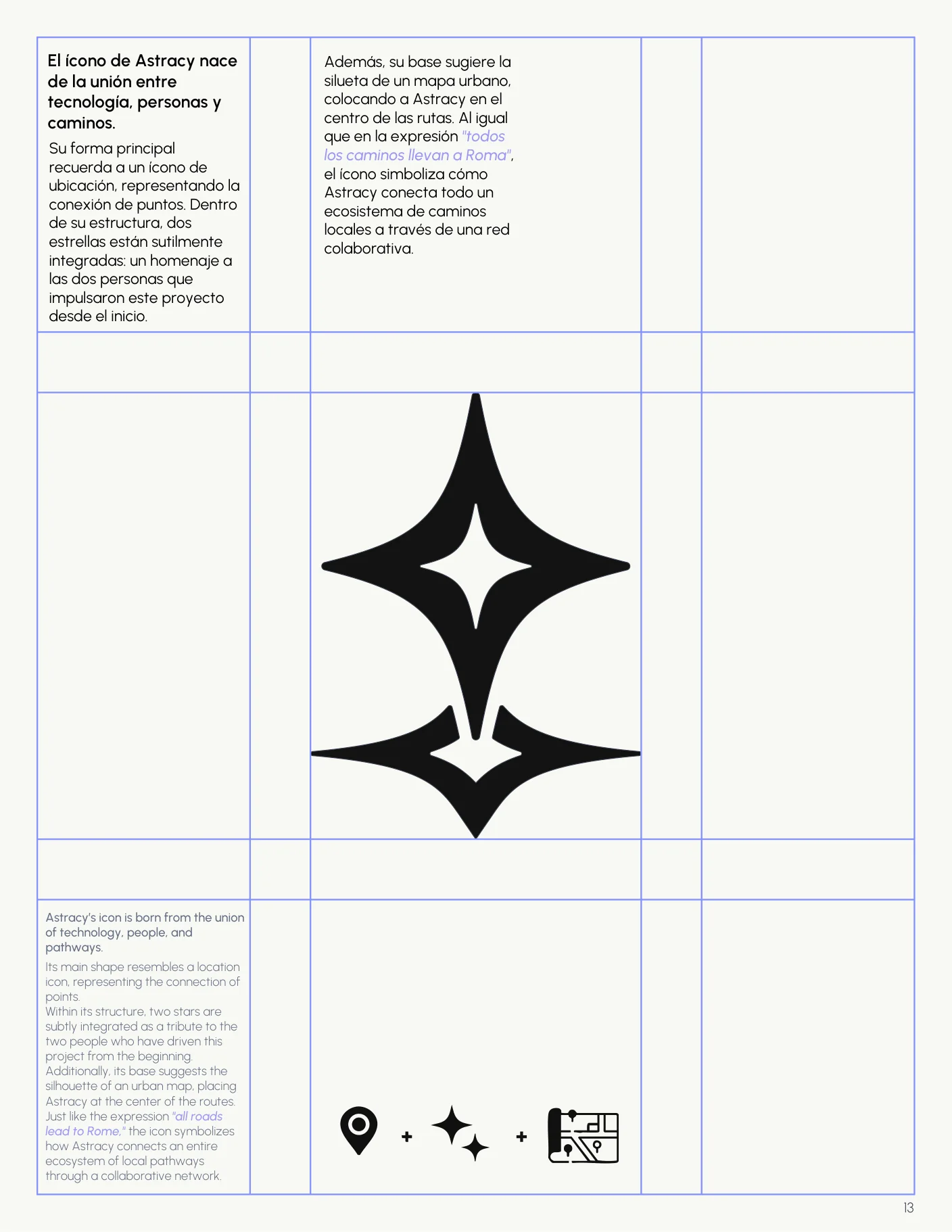
The icon had to do three jobs at once: read as a location pin (the pickup model), read as a star (the brand world), and carry the human story underneath. Not three marks. One shape holding all of it.
The solution was a location pin redrawn as a four-pointed star. Read it fast and it's a map pin, a fixed point in a network. Read it slow and the geometry turns stellar: the point drops like a pin, the axis spreads like light.
Hidden details are brand equity. Most people never notice them. The ones who do remember them forever.
Inside the mark I tucked two stars, invisible at small sizes and deliberate up close, one for each founder who pushed this from the start. The wordmark hides its own: a small star living in the crossbar of the t. Recognizable as a word, richer when you look closely.
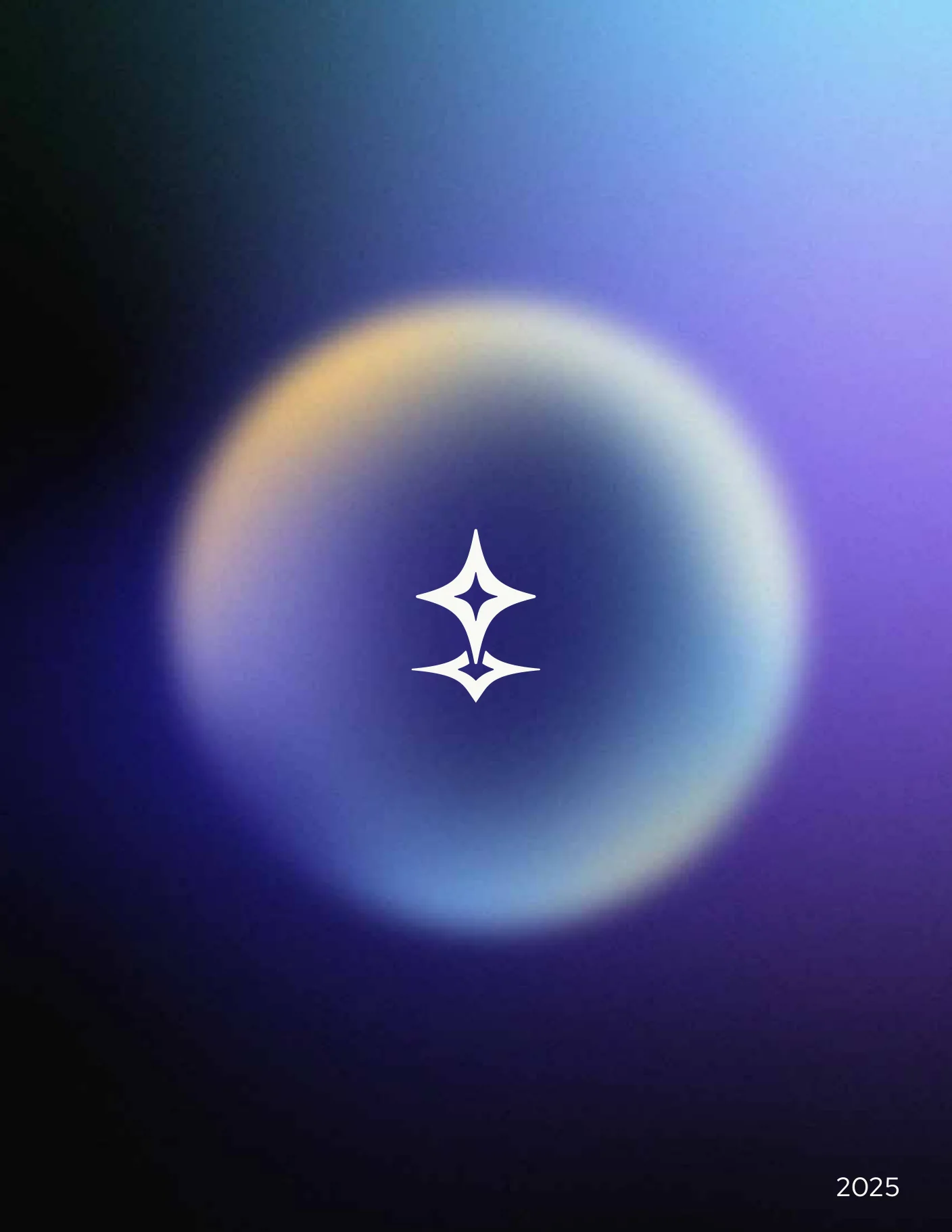
The palette is built as a journey. It opens in deep space, dark orbit blues and dense navy, and travels through lavenders and glacial blues into warm amber and soft yellow. Technically, cold to warm. Conceptually, machine to human.
That move isn't decoration, it's the whole belief: technology exists to serve people, not the other way around. The further you travel along the spectrum, the more you feel the human side of the brand.
Dark blue says we know what we're building. Warm amber says we know who we're building it for.
Four families, four tones each. Orbit Blue carries the authority. Lavender softens it without losing the tech read. Glacial Blue brings movement. Warm Amber brings the human city. Gradients hold it together, with a fine grain on top so the surfaces never feel flat. The cosmos has texture.
Click any swatch to copy its hex
Four chromatic families, four tones each, plus the gradient that carries them from the technical blues into the human ambers.
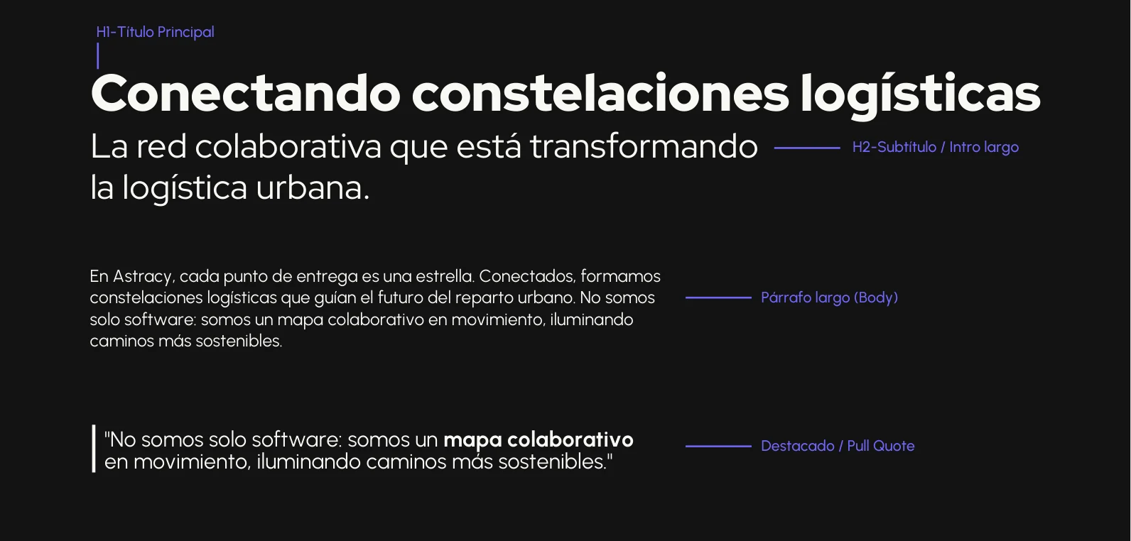
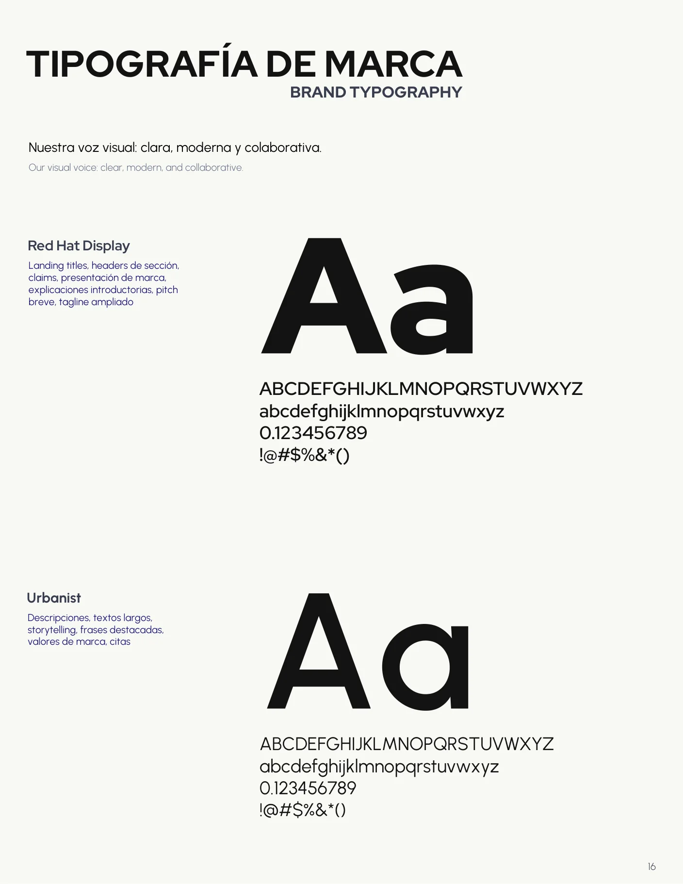
Two typefaces, same dual character as everything else. Red Hat Display for headlines, geometric and sure of itself. Urbanist for body, fluid and easy to read.
The voice followed the strategy: confident, human, never corporate. The brand book opens on the line that says the whole thing, conectando constelaciones logísticas, connecting logistics constellations.
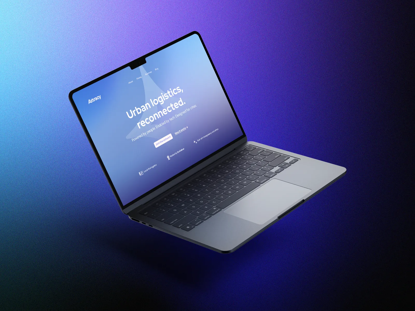
A few months after the brand launched, EcoDeliver came back for the website. Same system, new surface. The job was to turn the brand into a product people could actually use, not just drop the colors onto a template.
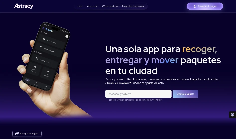
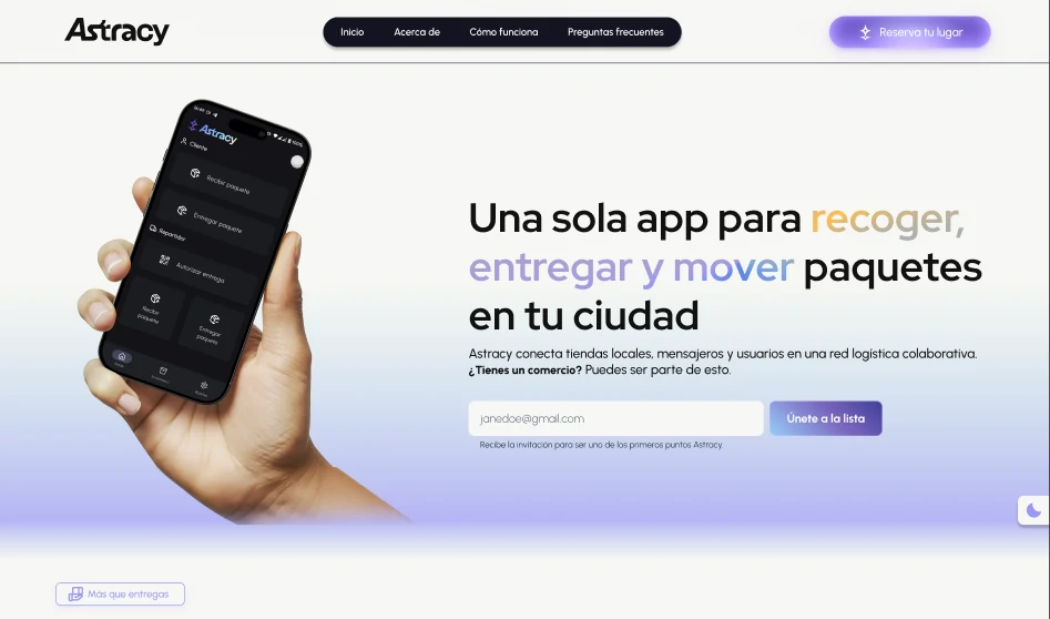
The gradient world carried over, the star as the anchor, white type on dark ground, amber saved for the moments that matter. We shipped the dark version, then added a light one so the brand could breathe in both.
The website wasn't a new project. It was the same brand, finally moving.
I designed it. EcoDeliver's team built it. That split felt right: the brand was mine to design, the product was theirs to ship.
A peek at the rest of the page. Tap any card to flip it from dark to light.
Four fully developed names, each with etymology, tagline, and rationale. Astracy selected, for what the word could carry.
Purpose, promise, positioning, brand territory, the Creator archetype, and a tone of voice that stays human.
Imagotipo, isotipo, and wordmark. Primary, color, and gradient variations with full usage rules. Two hidden stars.
Four families, four tones each. Neutral stack, gradient rules, and a grain spec so the surfaces never feel flat.
Red Hat Display for display, Urbanist for body. Scale, hierarchy, and applied specimens across dark and light.
Full visual design of the Astracy site, built on the gradient system. Designed by me, implemented by EcoDeliver.
"Dana didn't just design a brand. She understood our business and our vision, and turned it into something that actually looks like the future we're building."
The same strategy-first thinking you just read through, pointed at your brand.
What Astracy became next, a full rebrand for the same client, with a new name and a sharper story.