Brand Strategy
Purpose, mission, vision, promise, positioning and territory, built from scratch. Replaced Astracy's tech positioning with a community-first framework.
dropick is the rebrand of Astracy. Same logistics engine, rebuilt for the people who actually run it, the corner stores and neighborhood shops that power the network.
Astracy landed well, internally. The brand was sharp, the system was tight, and EcoDeliver loved it. But when they put it in front of the people who'd actually operate the points, the local business owners, corner stores and pharmacies across Spanish-speaking cities, the response was honest: it doesn't feel like us.
That wasn't a failure. It was intelligence. Astracy was designed for what the founders believed about their brand. dropick had to be designed for what the market needed from it.
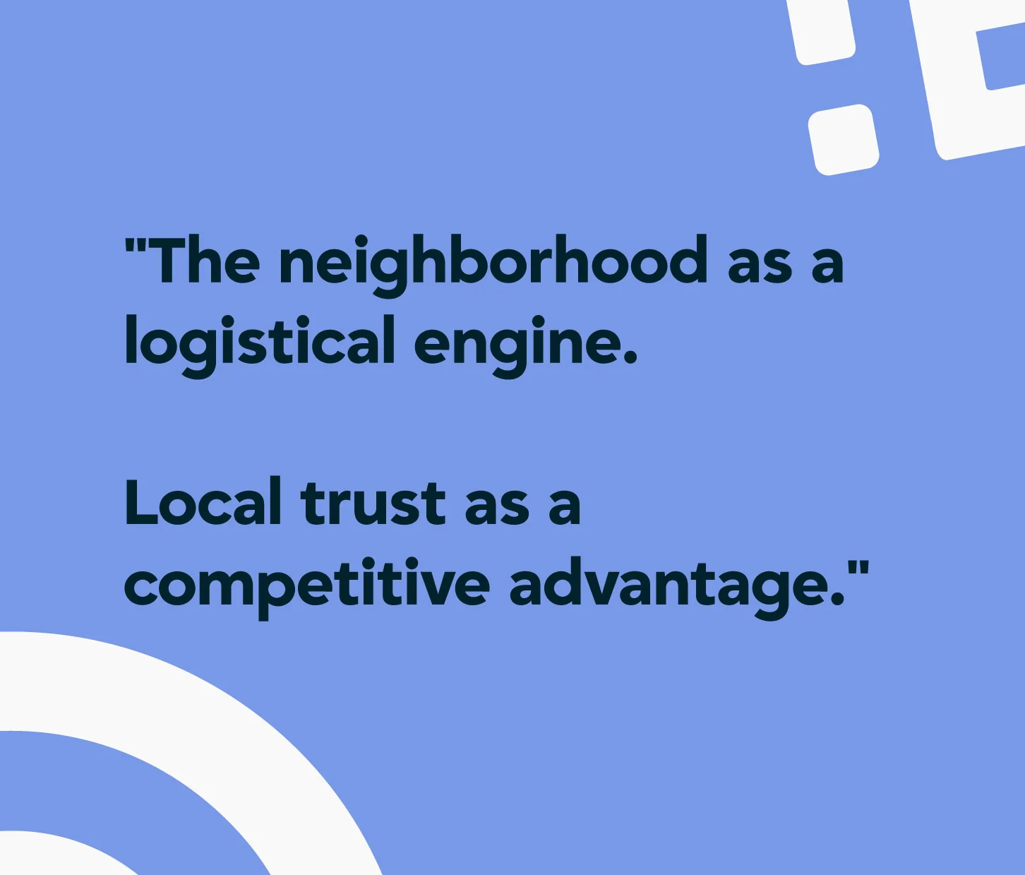
The core insight changed everything: PUDO points aren't technology, they're people. Don Carlitos' hardware store. María's stationery shop. The pharmacy the whole neighborhood trusts. These aren't logistics nodes, they're the social fabric of a city. The brand had to sound like it understood that.
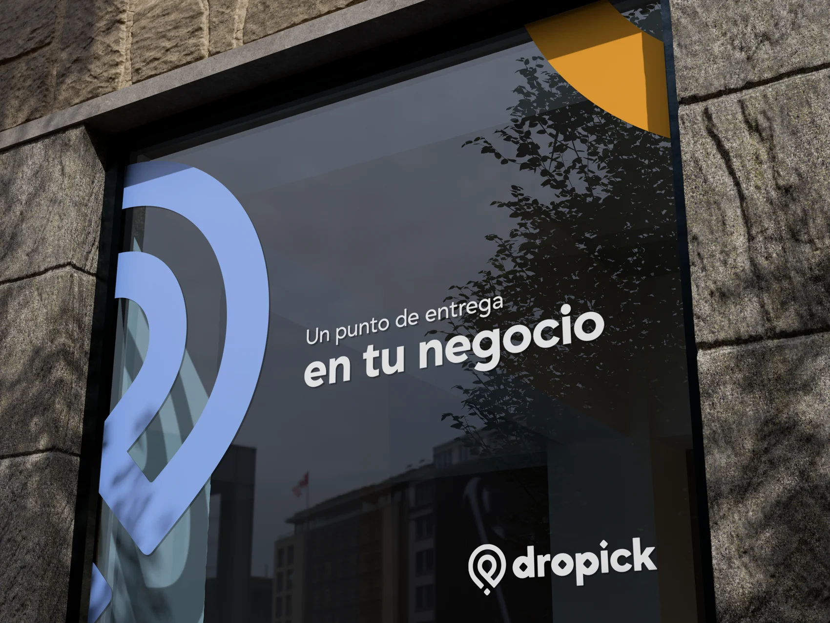
The brief wasn't "make it friendlier." It was: design something a corner store owner would put on their window and feel proud of. That's a completely different design problem.
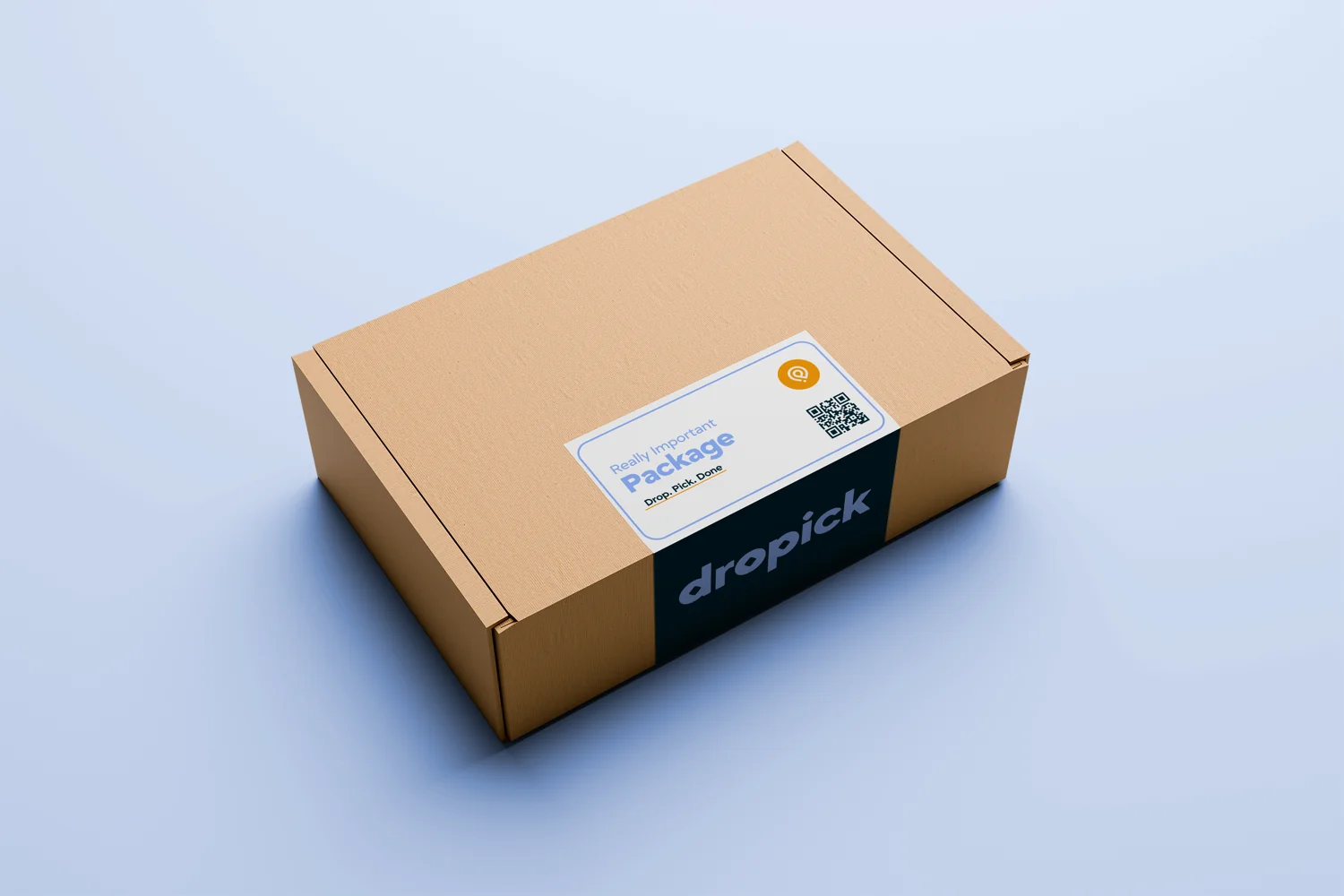
The name came straight from the operation: you drop a package, someone picks it up. Direct, action-based, impossible to misread. Where Astracy was abstract and aspirational, dropick is concrete and immediate. The tagline almost wrote itself: Drop. Pick. Done.
The strategy turned warm. The archetype became El Compañero, not the hero that saves the barrio from above, the partner who shows up, explains how it works, and makes sure it goes well. Three values mapped straight to the product's behavior: cercanía, confianza, dinamismo.
Astracy said "optimiza tu operación logística." dropick says "gana más con el espacio que ya tienes." Same idea, a completely different relationship with the reader.
The first approach was honest about the brief: a D, a directional arrow, a location pin. Drop. Pick. Done, but drawn. EcoDeliver liked it right away. But one thing nagged me, the generic location pin.
The client didn't mind that the pin looked like something that already existed. People recognise pins, and that recognition has value. I wasn't willing to accept it.
That became the whole tension. A generic pin is clip art, you're putting your name next to an icon that belongs to no one. So the question changed: what do you add to a location pin to make it unmistakably dropick?
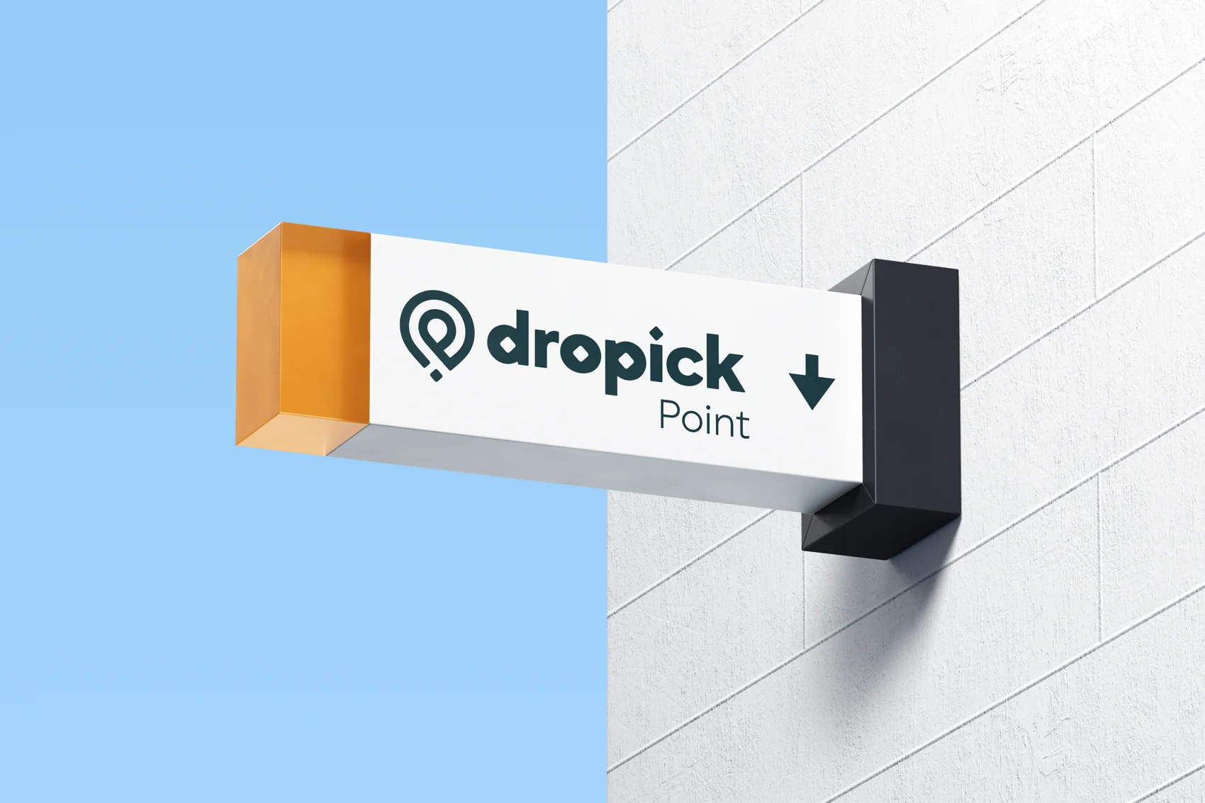
Twenty-four directions were developed and rejected before the answer held. The breakthrough was accepting the premise without accepting the limitation. Keep the pin. But open the ring so it breathes, and put a diamond at its centre instead of a dot. Look closely and that diamond reads as a "d" and a "p", the initials, never announced. Something you discover, not something you're told.
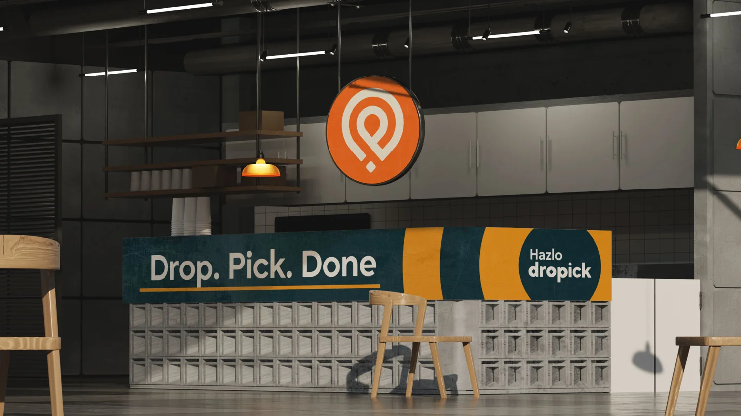
Astracy's palette travelled through space, cold and precise, warming only at the far end. dropick inverts the logic. The warmth is upfront. The darkness is the anchor, not the destination.
Noche Urbana is the deep, slightly warm teal that reads like the city at night, not cold corporate black. Naranja dropick is the action color, everything that says "move." Ámbar Vivo carries the warmth at lower energy, and Cielo Digital keeps the tech credibility the product still needs, the sky above the barrio.
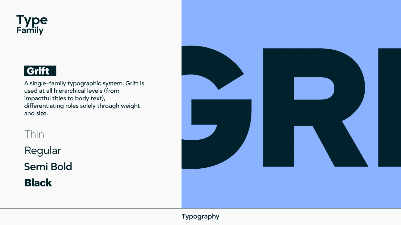
Type was simplified from Astracy's two families down to one: Grift. It isn't a beautiful typeface trying to be noticed. It's a functional one that knows exactly what it's there to do.
The six-color system. Click any swatch to copy its hex.
Three primaries, three secondaries. The warmth leads, the dark anchors, the blue keeps it credible.
Purpose, mission, vision, promise, positioning and territory, built from scratch. Replaced Astracy's tech positioning with a community-first framework.
Dual archetype, El Compañero and El Explorador. Three values, cercanía, confianza, dinamismo, each with a behavior and a tone of voice.
Isotipo (the opened pin with a hidden d+p diamond), logotipo and imagotipo. Four variants across light and dark. 24+ explorations before the final.
Six colors across two palettes, with recommended combinations mapped to use cases, and full HEX, RGB and CMYK values.
A single-family system on Grift, Thin to Black. Hierarchy by weight and size only, no mixing families. Simplicity is the point.
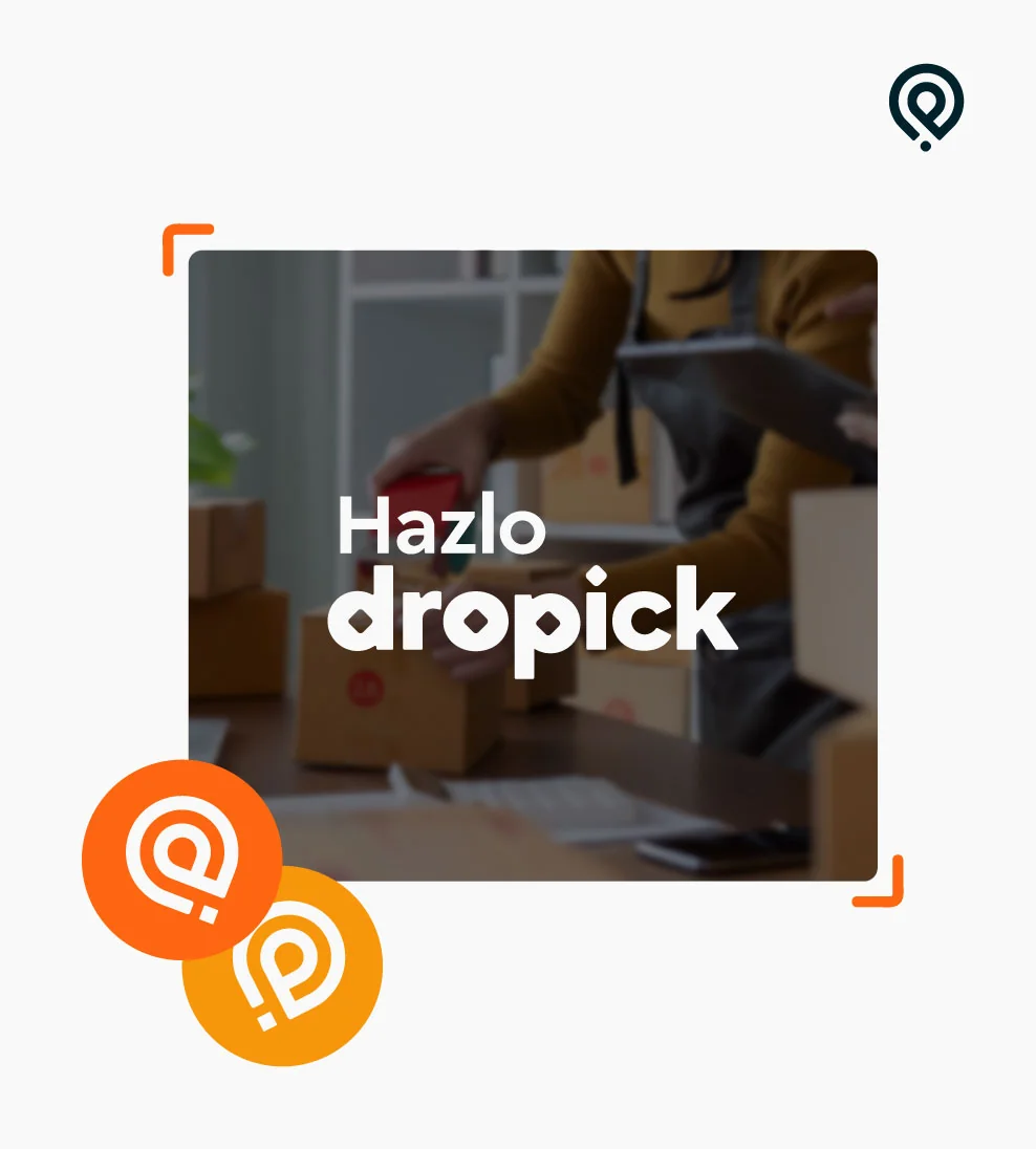
Storefront window vinyl, blade signage, package box and label, partner QR badge, stickers and tags, app onboarding and social.
"With Astracy they understood our vision. With dropick, Dana understood our users. That's a completely different level of work."
The same strategy-first thinking you just read through, pointed at your brand.
The cosmic, tech-forward brand that proved the product, and proved the market needed something else.