Logo System
Primary lockup, isolated brandmark, and wordmark-only variations. Built for every context, from favicon to conference signage.
OutSight Team builds dedicated editorial desks for media agencies. Not a shared pool, a team that works exclusively for one client.
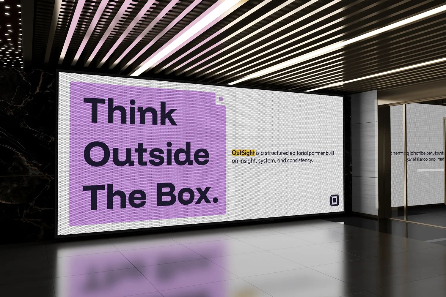
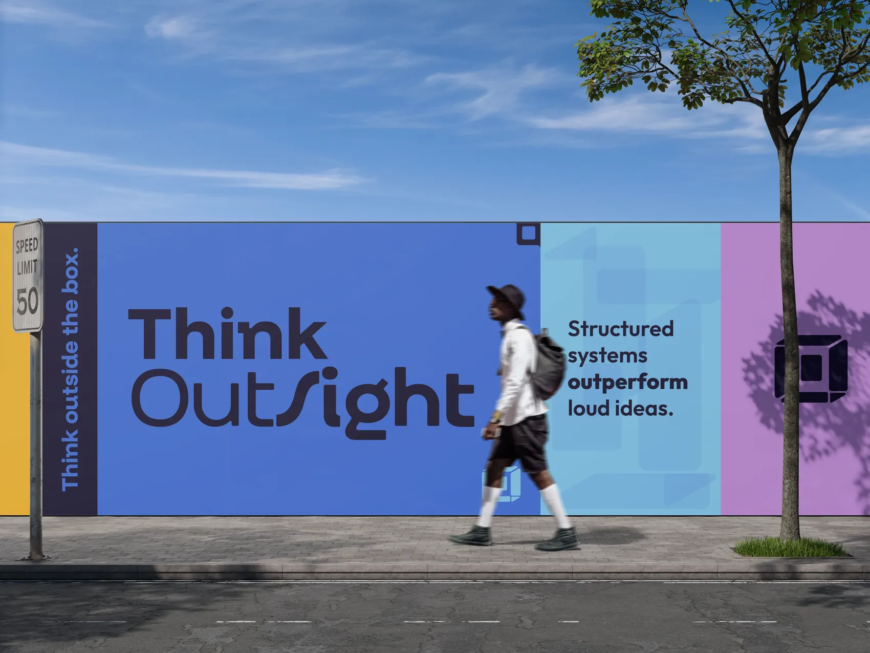 click to think outside the box
OutSight Team builds dedicated editorial desks for media agencies. Instead of pulling whoever's free from a shared pool, they build a team that works exclusively for one client. Same people, same standards, same workflow, every day. The client agency still sets priorities. OutSight runs the desk.
They came with a Canva pitch deck they'd built themselves and no brand identity. What they wanted was premium, modern, nothing that reads like generic outsourcing. They knew who they didn't want to look like. They just hadn't figured out who they did.
Two things were still open. They weren't sure they needed a logo at all, and they had real anxiety around color. A previous project had left them associating orange with something unrelated, so committing to any single color felt risky.
A client who wanted to look like a category leader, but wasn't sure they needed a logo or a color. That's where we started.
The "name is enough" argument makes sense until you actually need to put the brand somewhere besides a Word document. Favicon. Email signature. Slide deck cover. A booth at a conference. A wordmark works when people already know who you are. OutSight was starting from zero.
A brandmark can carry meaning. A wordmark carries letters.
The concept landed on a deconstructed box in perspective. Each segment separated, but still readable as a box. The whole idea is about thinking outside the box (it's literally in the name), and I didn't want to illustrate that the obvious way. So I took the box apart. The mark ended up holding both sides of what they do at once: structure and perspective.
Their first reaction was that it felt retro-modern, not professional-modern. Different things. I refined until it worked.
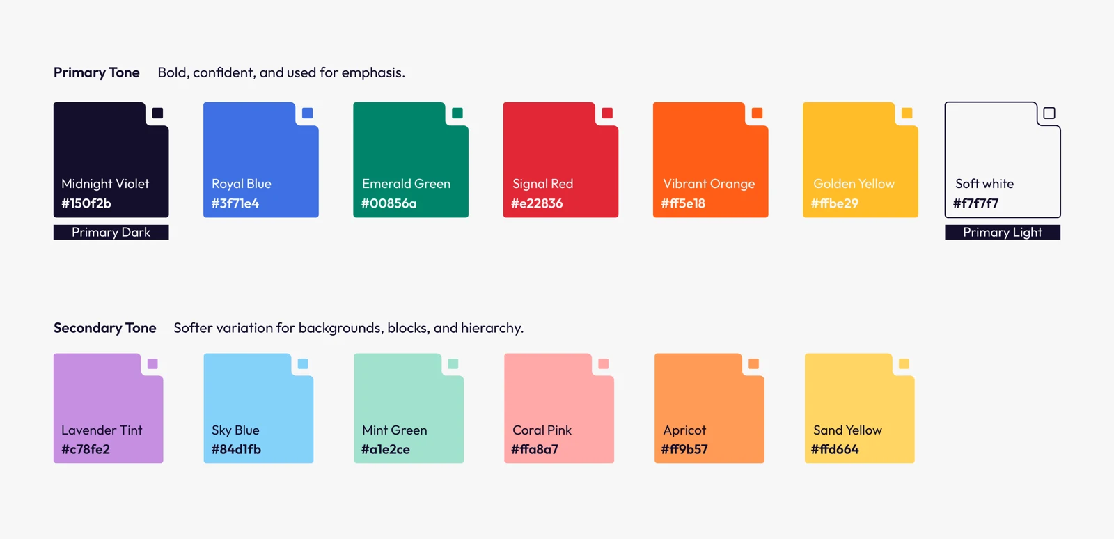
Their instinct was to pick one color and commit. The fear was picking wrong, or picking something that carried the wrong associations. So instead of making them choose, I built a full paired palette.
Black is what you use when you haven't thought about it. Dark violet is a decision.
Six primaries, each with a softer secondary. The dark violet anchors everything, text and dark backgrounds. When they asked about narrowing to one hero color one day, I brought up Coca-Cola. Everyone knows that red. OutSight can build that kind of recognition. It just takes time.
Click any swatch to copy its hex
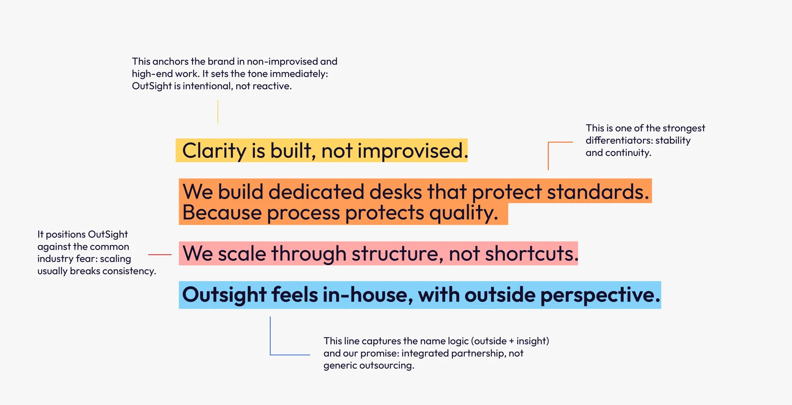
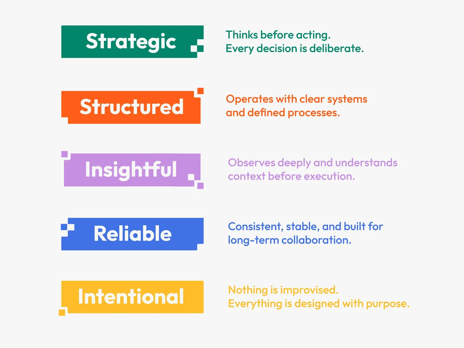
Voice, character, and the reason the brand exists. Four lines anchor how it behaves, each aimed at a specific industry fear. Clarity is built, not improvised.
Primary lockup, isolated brandmark, and wordmark-only variations. Built for every context, from favicon to conference signage.
Six paired primaries with softer secondary tints. Dark violet base. Usage guidelines for text, backgrounds, and accent.
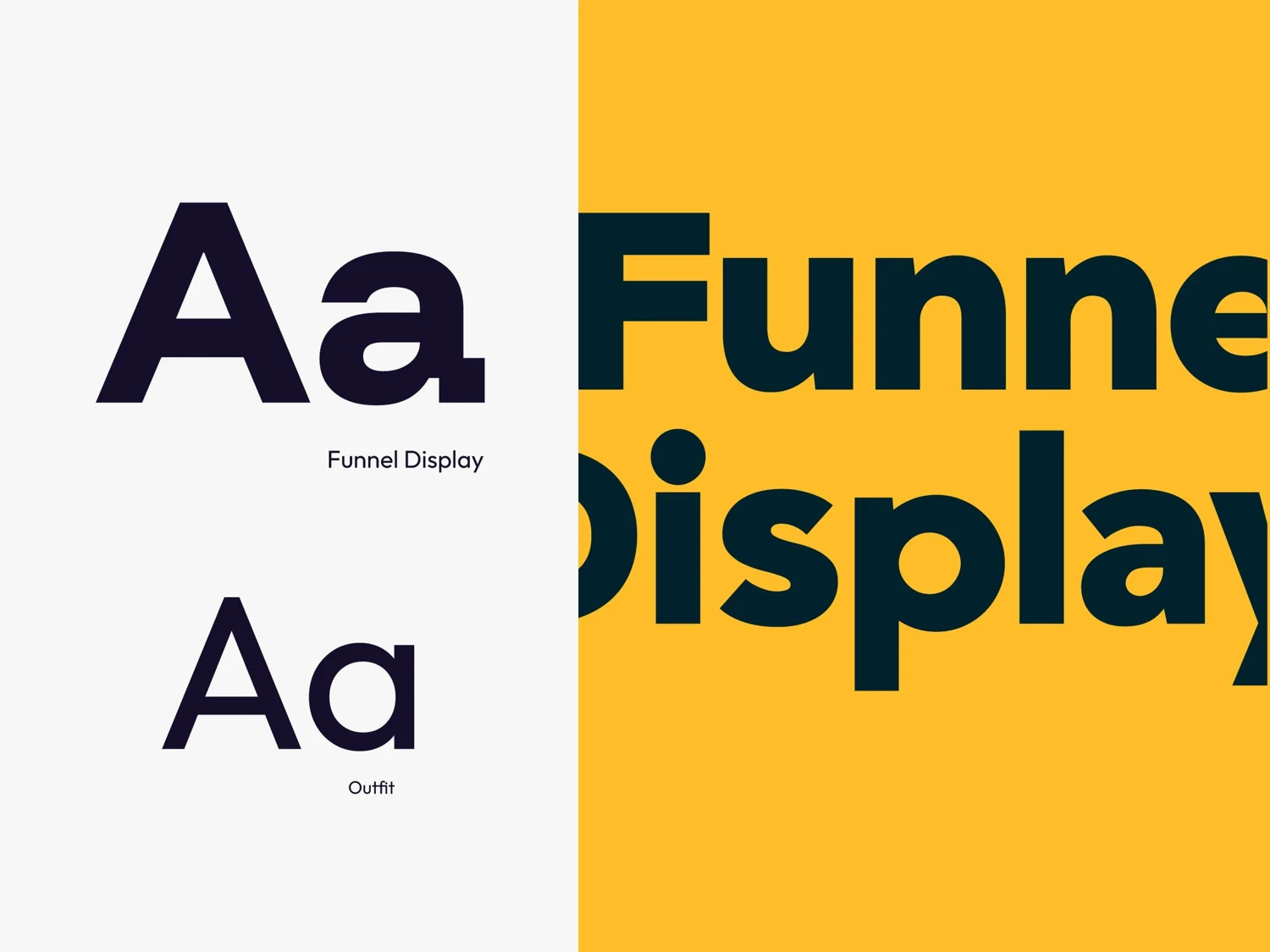
Funnel Display for headlines, Outfit for body. A type scale with hierarchy rules and applied examples.
The Sage and The Creator dual archetype, with tone of voice and messaging drawn from how they actually talk.
The story and principles that hold the whole thing together, written to be used, not framed.
From a self-built Canva deck to a branded presentation that matches where they want to be positioned.
"I bet you never had a client that accepted everything on the first turn and you hope other clients are like this, because we're loving everything you're showing us."
The same strategy-first thinking you just read through, pointed at your brand.
Naming, visual identity and visual design for a PUDO logistics platform.